|
I was recently going through the catalogue of my work, and couldn't help but notice how, over the years the appearance of my main characters has changed. When I first got started about 17 years ago, I drew characters as I had learned from the books I was reading at the time: "Cartooning: The Art and the Business" by great New Yorker cartoonist Mort Gerberg, and "The Cartoonist's Muse" by Mischa Richter and Harald Bakken, also of New Yorker fame. 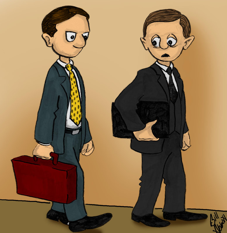 I used India ink on Bristol board and added shading with an ink wash applied with a sable brush. It was an immensely enjoyable time as I learned the art and the various techniques employed by my favorite cartoonists. I'd started to develop a modest body of work, and since my military obligations prevented me from conducting any meaningful, consistent marketing, I submitted my work to the relatively new Cartoonstock agency in the UK. To my surprise, they were willing to represent my work, which resulted in the first cartooning-related contract I ever signed. In addition to their representation, the good people at Cartoonstock, in particular Joel Mishon, offered advice to help improve the prospects for my work, notably, making my characters more cartoonish rather than realistic. With a little experimentation, I gave my characters a rounder head and a more squat appearance, like below: 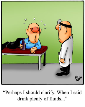 Like almost every cartoonist I know, I'd hoped someday to see my cartoon in syndication. I'd submitted to all the major syndicates, and some not so major, all with the same result - not so much as a human-signed response, just a string of form rejection letters. Truthfully, when I look at my work now, it's apparent I just wasn't ready. Add to that, I continued to deploy in the military, and syndication would have resulted in disaster. As I continued to produce my work, I began to add physical features that I found humorous. I noted that whenever I saw glasses in other comics, it seemed to me, there was something just a little more visually humorous. As a person who has worn glasses all my life, I'm not sure that's a good thing. At first the glasses I drew were either round or square, as below:  When I drew the glasses, I intentionally left them entirely blank - no indication of the position or shape of the eye, and no color other than a bland white. I'd read somewhere that the human mind tends to fill in the blanks when there's a piece of a picture that's missing, which for a cartoonist, could be a benefit. People import to their visual stimuli things that they've drawn from their own experiences and recollections. They actually fill in the blanks in a way that makes the visual stimuli most sensible - even personal - to them. So often I post a cartoon, and the feedback I get on what people interpret in it is varied and sometimes surprising. To me, that's a great thing - we see what we want to see, and it can make the cartoon funnier than anything I could ever draw. I'm a big fan of the cartoon "Herman" by Jim Unger, and I thought he used open space and simplicity to the point of brilliance. While I tend to draw in a fuller, less airy style, I would be remiss if I didn't mention this comic genius as someone who had a definite impact on my work. The next period in the evolution of my characters was the result of actually sitting down and reflecting on the physical characteristics and elements that I find humorous. From that, the glasses evolved into the type that my great grandparents wore - the horn-rimmed glasses of the 1950's and 60's. And since I took Joel Mishon's advice to heart, I made them big. Really big.  At this point, my characters started to become identifiable as "Spectickles". With a little tweaking along the way, including the inspiration of Walter Matthau and Ethel Merman, my "Spectickles" characters were more or less complete. Since being syndicated, first by Inkbottle Syndicate in 2014, then with Creators Syndicate in 2016, "Spectickles" has been refined further still. Who knows if they'll transition more in the future - we shall see! 
12 Comments
Linda Breeden
9/13/2017 12:45:21 pm
Enjoyed reading your creative background. Always look forward to seeing your cartoons on Facebook.
Sue Searcy
9/13/2017 02:26:14 pm
Love your work from beginning , to now. Look forward everyday to
MaryBeth
9/13/2017 08:40:21 pm
I like the guy in the exam room and his choice of "fluids". Maybe you could draw that scene again with your current Specticles characters? 9/14/2017 07:48:54 am
I'm glad you like it Marybeth - redrawing it might be a possibility!
Joan Eddis-Koch
9/14/2017 03:39:53 am
I loved being able to see the evolution of not only the characters but the cartoonist! Thank you so much for sharing your story. It's one of inspiration and determination! Right onward! 12/15/2022 09:16:01 pm
takipçi satın al ve sitemizi ziyaret et: https://takipcim.com.tr/ Leave a Reply. |
 RSS Feed