|
We'd been out in the back yard on a beautiful summer afternoon last year, and while we were getting ready to throw dinner on the grill, I'd taken a few photos of Arleigh basking in the warm sun. She looked so content - we'd been playing with her, throwing her favorite soccer balls around and she'd jump in the air trying to catch water we'd toss up from buckets. The pictures came out beautifully, and as I was going through photos looking for inspiration for my next painting, I came across those of Arleigh. Step one for me is cropping the original image so that it captures only what I'm looking for. I really wanted to focus on Arleigh's eyes, so the painting would just be her head and upper body with sunlit green grass faded in the background. Once decided and done, it was time to start sketching. I started with a rough pencil sketch to get the shape and major physical components. 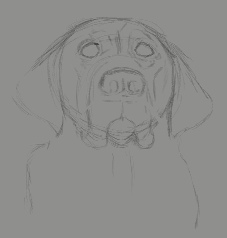 Once the initial rough sketch was worked out, I moved on to a more refined pencil sketch, adding additional details, darkening the line work, adding and subtracting a bit until I'm satisfied. 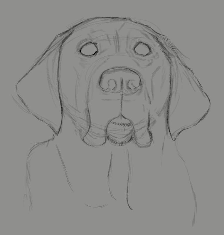 Next up, laying down local color. On a new layer in Photoshop, I carefully examine the subject photo and look for thee middle ground, color-wise. With the bright sun on a black dog, the median color is more of a purplish blue, and it looked odd when I painted it. But I figured if I get it wrong, I'd just delete the layer and begin again. Also, the eyes look very odd with just that middle of the road color, but as I proceeded to the following steps, it worked out pretty well. 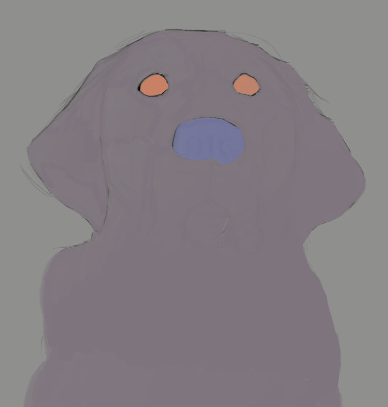 With the odd-looking local colors added, it was time to begin adding values. The process I'd learned was to start adding darks in a new layer, then one for lights, then back to darks and so on, working back and forth subtly until the painting reaches the point of completion. 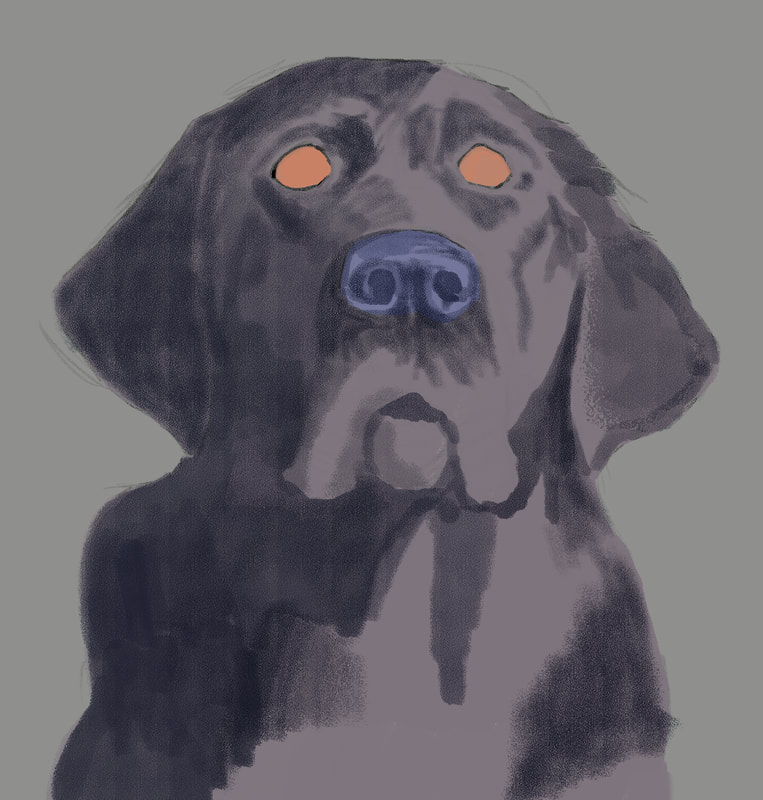 This is where the painting process gets really enjoyable - where the painting begins to take on life. The hazard is, for me, I get so anxious to get to all the detail areas, like the eyes so I can see what they'll look like, but restraint is necessary. Being patient and working gradually between darks and lights to give the subject dimension - that's how to get to a painting worth keeping. 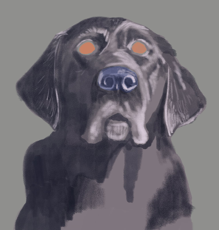 The painting was really starting to come together with the first lighter values pass. Lightening up the fur around her mouth and adding the lighter areas on the more prominent features of her head and torso started giving a more life-like appearance to Arleigh. 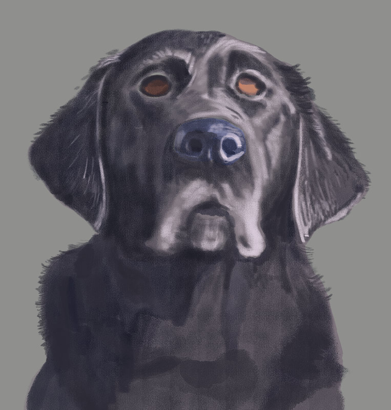 With the next pass, I added more shadow to her torso, and started giving some attention to her eyes. Due to the position of the sun, there was a cast shadow that deepened the color on the upper half of her eyes. 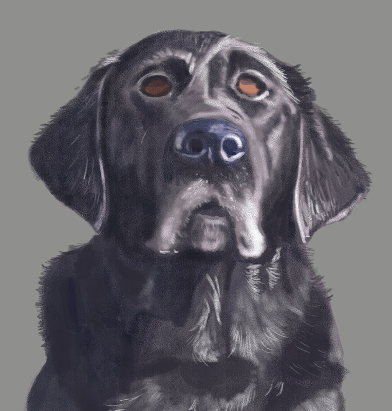 At this point, I started adding some reflected light onto her shiny fur, and to the features of her head most affected by the sunlight.  For this shadow pass, I added dark, thin lines amid the light to give more dimension to her fur, and lightly painted in the reddish brown that could be seen in the bright sunlight. 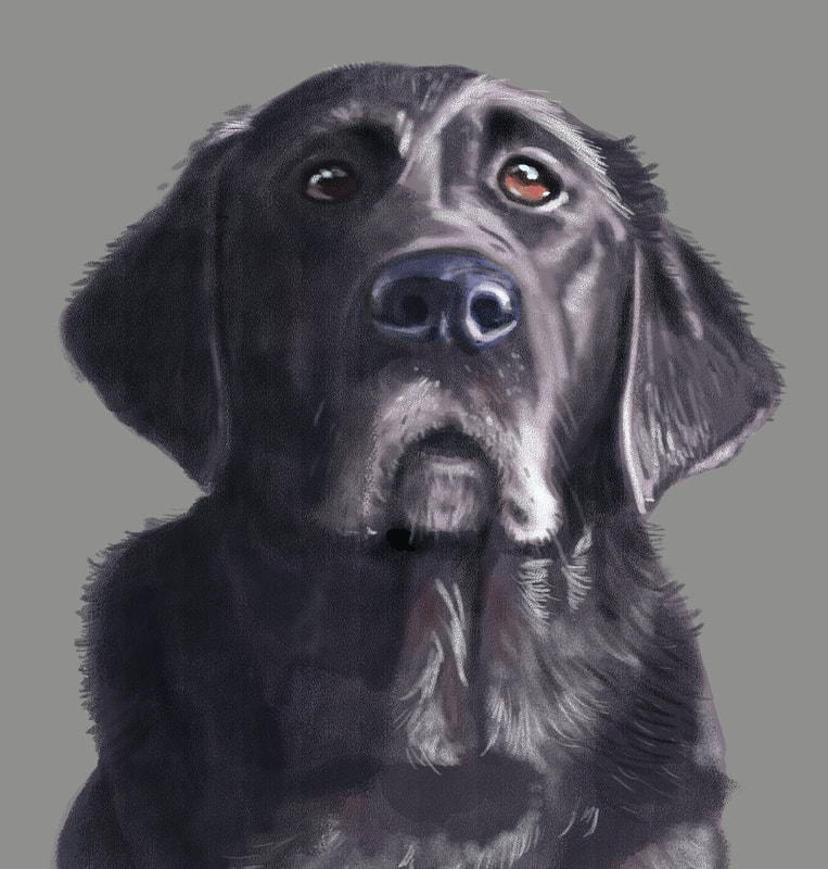 This was the final pass before focusing on the background. I added the reflection on the eyes, which really makes the painting come to life, as well as small spots along the bottom eyelid to create the look of wetness. I was really happy how this came out, and now I had to figure the best way to add appropriate background. What I decided to do was photobash - the process of taking a photo, or a piece of a photo to add an element to a painting, so that the different forms of media come together seamlessly. In the series of photos I'd taken that day was a patch of lawn that would work. I imported it into Photoshop, cropped out everything but a square patch of grass, the manipulated brightness, contrast, hue and saturation, and finished up with the gausian blur tool to put Arleigh prominently in the foreground and the lawn, as it would be, out of focus in the background. 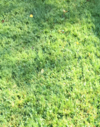 Final, complete painting. I was pleased with what I'd learned by creating this image, and look forward to creating many more, branching out into subjects that are more challenging and require more proficiency and some risk. I neglected to mention in the beginning, but this painting was created using Photoshop CS5 (I have a subscription to the latest Adobe products, but I'm a creature of habit and love this older version of Photoshop.) on a Wacom Cintiq 24" HD monitor. In the end, I had something like a dozen or so layers, and the image was created at 300 dpi. I only used one brush, and it was one I purchased from Creatureartteacher.com - the Aaron Blaise website where I've purchased many of his digital painting courses. The actual brush name is Pastel C - it's got a great texture and I love the results I can get with it. I use it for both penciling and painting. Many thanks for reading, and I hope you enjoyed. Now, on to the next one ... 
3 Comments
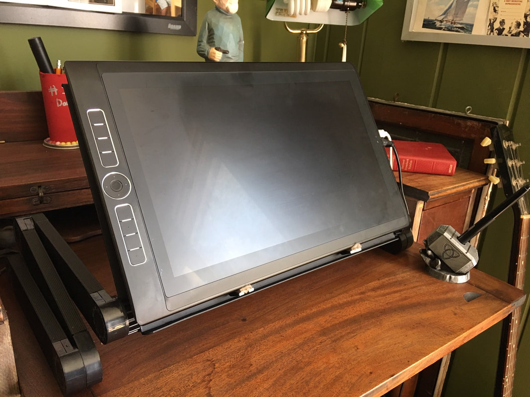
I ended the first part of this 2 part series with a more or less completed painting of my Black Lab, Arleigh, but no background or other elements. To remedy that, I wanted the painting to tell a story, and whatever I was to add to it needed to be in service of that. Arleigh is definitely an alpha dog - she has to be in charge. As a cartoonist, I often write using juxtaposition as a launch point for creating humor, and that's what I did here.  I decided I would add a cute kitten and Arleigh's bed. The expression on Arleigh's face could be interpreted in a variety of ways, but when I looked at it, a rough scene or scenario sprang to mind. Step one, I needed to find visual references to add to the painting. Arleigh's bed was easy and accessible, although I knew I'd need to modify it to add more to the story of the picture. I also needed it to be in at least somewhat similar lighting conditions, so I placed near a window and took this image. 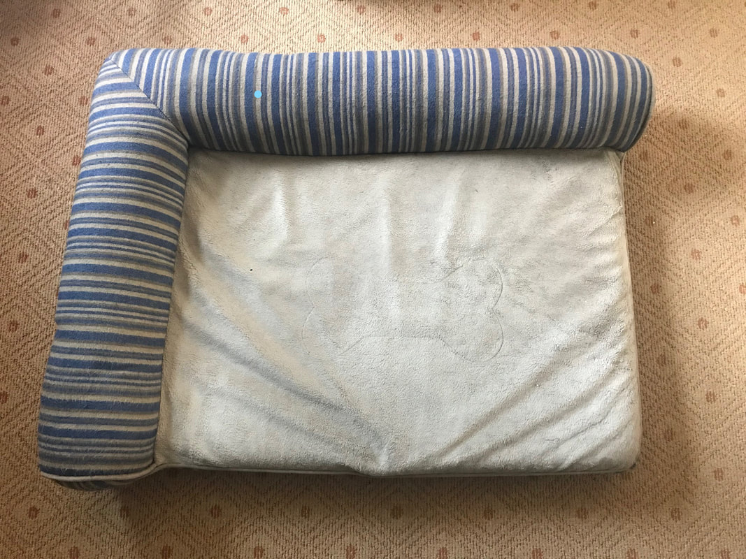 Next up, I needed a cute sleeping kitten image, so I put on my thinking cap and pondered the search phrases I would need to use to find just what I was looking for, and came up with, "sleeping kitten image." Brilliant, no? I couldn't the colors and pose I wanted, so I studied several photos and created my own. Like a Doctor Frankenstein of kittens. So I've got that going for me. Next up, I needed to elongate the canvas so I could situate the additional elements into the painting. I kept everything at 300dpi, so my computer wouldn't protest too much under the strain. Next up, a rough sketch of Arleigh's bed with a few enhancements and simplifications to better tell the story, and not push my very limited digital painting skills. 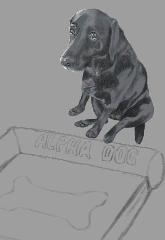 Nest up was the sketch of the kitten. I rough penciled it in and placed it where I thought it made most sense for our visual story.  Next on the list was to start adding local color, or the color of an object as it is without being overly influenced by light or shadow. 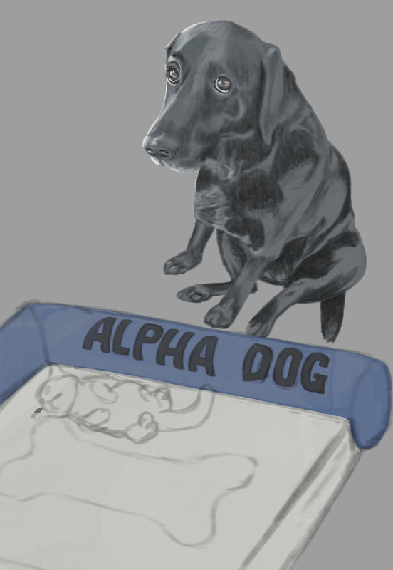 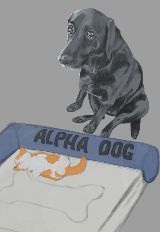 Once all the elements were added and the local color decided on (I couldn't find any kittens with that specific coloring - I wanted the orange to balance the blue of the bed, so I came up with that color mix for its fur), it was time to add values. One of the things I've heard repeated in virtually all of the digital painting courses I've taken is push and pull - to go back and forth between dark and light as you work your painting. So I started with a shadow layer, then a layer for adding lighter areas, then back and forth till all of the values were completed, or at least as complete as I could make them. After a final pass of subtle light and shadow, I needed background. I wanted something simple to keep the eyes on the subjects in the painting, and we happen to have a wood floor in our home. I didn't like any of the photos I had, so I did an internet search for "old wood floors" and found one that might work. I changed the orientation to match the setting, the adjusted hue/saturation and color balance, added a soft light coming from the left of the image to match the light on the subjects, the finished with a gausian blur to keep the subjects clear in the foreground. It didn't come out quite as I'd hoped - the light doesn't match as it should, there are a good number of imperfections in both the drawings and the painting, but I consider this one of the steps in a much longer learning process. You have to step in the arena no matter your perceived imperfections in skill. That's where the skill will be acquired - in the doing. So here's mine, warts and all, and on to the next. 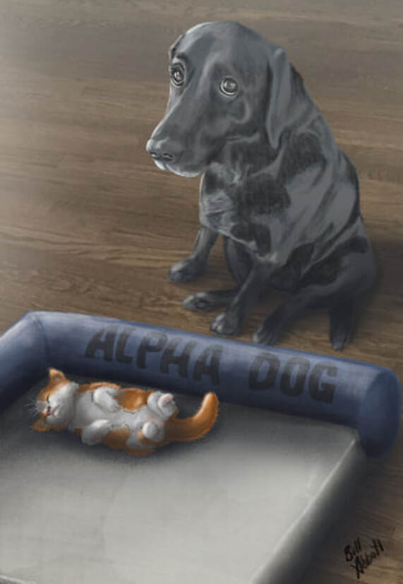 I've mentioned them a bunch of times, but one of the things I enjoy most is watching and learning from artists whose work just blows me away. Recently, I've purchased online digital painting classes from Aaron Blaise (creatureartteacher.com), Schoolism.com, SVSLearn.com, and ctrlpaint.com - all well worth every penny. One thing I learned early in life is that you've gained little if what you've been taught isn't put into practice. Aaron Blaise's digital painting course includes a demonstration of him creating a beautiful rendering of a lion, and he walks you through the process as he draws it. Using a Cintiq MobileStudio Pro 16", I parked my butt in front of the screen and started drawing along with him. The result was this picture, which is far from perfect, but I'm pretty happy with it, all things considered. 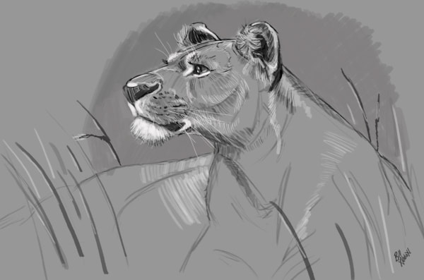 After this piece was completed, I wanted to try a digital painting that was entirely unique to me, so I went through photos I'd taken, and came across this one of our dog, Arleigh. She's a beautiful Black Lab, and in this picture, she'd just jumped up on our couch. We tried to discourage her from getting onto the furniture, and she knew she wasn't supposed to (the expression on her face tells it all), but it was a rule we infrequently enforced. I had to get a picture of her in that moment, and I thought it would make a fun painting, although I also thought it might be way above my skill level. 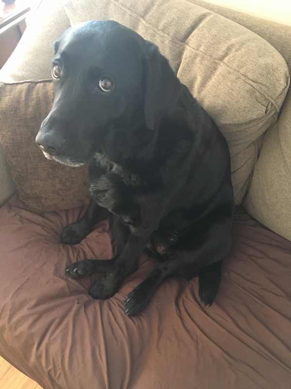 Step one would be creating a pencil sketch, albeit a digital one, to get the ball rolling. I'd just purchased a Cintiq 24" HD, and this was the first project I'd be undertaking with it. I'd gotten down a very rough drawing, then came in with more detail. Truthfully, I really didn't like what I'd ended up with and was going to scrap the drawing and move on to something easier. But then I thought, am I sacrificing the good with the valuable experience that will come from it in pursuit of an unrealistic, at least at this point in my development, ideal? I decided to charge ahead. 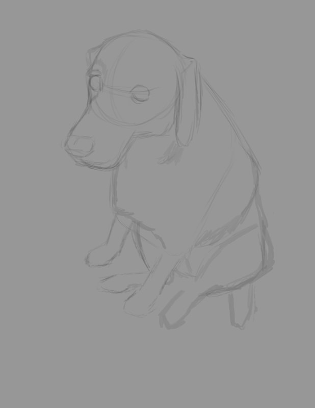 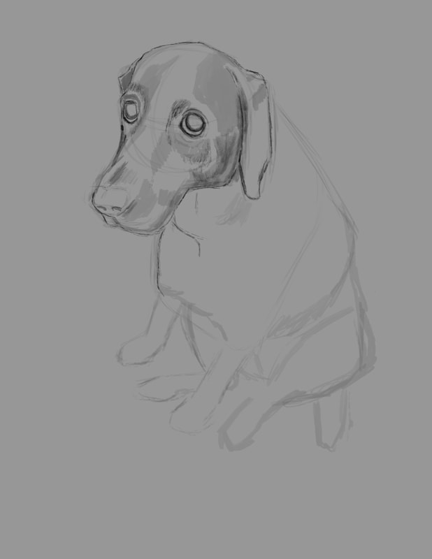 Once I got the sketch far enough along that it was sufficient to act as a guide for the painting, I created a new layer and painted in the local color, or the overall color of Arleigh's fur in a tone slightly brighter than the actual color. 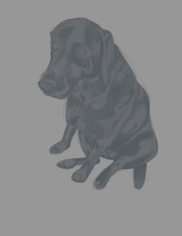 At this point in the process, I locked the local color layer and started adding darker values to it. At first, I'd intended to do any added values on their own layers respectively, but I'd gotten started on the values layer and was too far into it to turn back, so I rolled with it. Once I was satisfied with the first run of darker values, I created a new layer and began adding lighter values. One of the things I took onboard from the Aaron Blaise course was to work back and forth - dark then light, back to dark and so on. I found this process works really well. 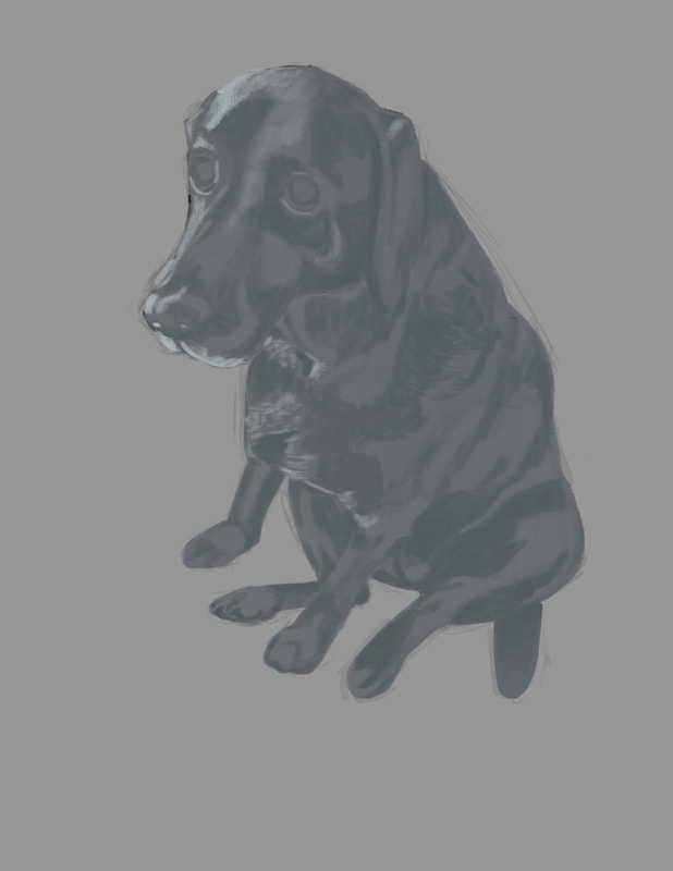 After the initial brighter values were added, it was back to the darker values again. I used the color picker in Photoshop, and dropped the lighter blue gray to a deeper shade, and I then dropped the opacity of the brush to somewhere around 70%. I also had the pressure sensitivity set, so that the lighter I touched the screen, the less pigment I would add, resulting in a more controlled feel. 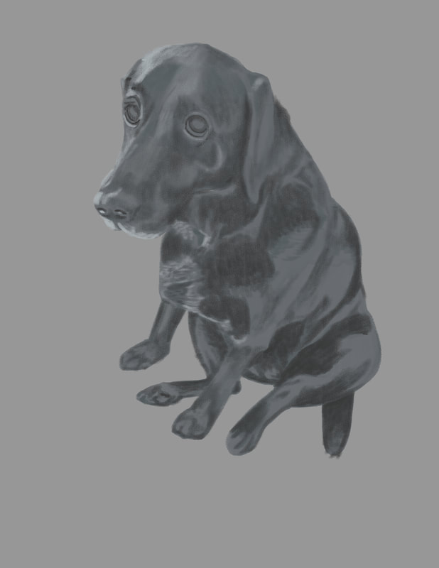 If there is any one element that creates the emotion captured in the picture, it's Arleigh's eyes. I decided to paint Arleigh's eyes on a separate layer, expecting to screw them up. Luckily, I didn't and while not perfect, I'm pretty pleased with the effort.  The last element I wanted to add to the figure of Arleigh was a technique used a good deal to wonderful effect, again by Aaron Blaise - very subtle rim lighting. If not overdone and crudely blatant, it adds a touch of drama to the painting. For a guy who's more at home with a hammer or a rifle, I'm pleased with this first independent effort. I learned a huge amount by doing this painting, and I hope to build on it as I get to work on the next one. But before I start anew, I have a background in mind for this Arleigh painting, which will be pretty challenging - if I can pull it off at all. Once that's complete, I'll add a second half to this blog post explaining how I did it. Thank you for letting me share this with you.
This won't come as a shock to any professional cartoonists out there, but the market environment for our wares is challenging at best, and it's about to get more so. As conventional paths to success disappear and new ones are sought, one of the few remaining, but financially rewarding avenues has been magazine cartooning. While the rates and numbers of venues has been trending down, single sales still range in the hundreds of dollars for some of the premier magazine outlets. This could be coming to an end.
CartoonCollections.com, an endeavor involving ex-New Yorker cartoon editor and fellow cartoonist Bob Mankoff, is actively reaching out to cartoon editors of the premier magazine markets (and likely most others) to sell cartoons through their site. Their offerings include tens of thousands of cartoons from the top creators of the New Yorker as well as collected works from other venues. If you're an independent cartoonist submitting to magazines, you will now be competing with what might be compared to the Walmart of cartoons, thereby putting the small corner purveyor out of business. CartoonCollections.com has made some serious market moves too - they've purchased CartoonStock in the UK, which contains a library of hundreds of thousands of cartoons. Full disclosure - I have worked with CartoonStock for many years and have nothing to complain about. The difference now is that their parent company is blanketing the market space, making a major sales push and reaching out to the editors. Magazines are switching to what appears to be an exclusive relationship with CartoonCollections.com, and, as it appears now, will no longer accept outside submissions from individuals. Where does this leave the individual cartoonist? There are still many magazine markets that accept individual submissions and will likely remain doing so. Trade magazines, private publications and sales built around long-standing relationships may also remain relatively unaffected - for now. But this appears to be a clear trend of contraction and consolidation which will no doubt affect how we do business in the future. CartoonCollections.com, as I currently understand it, accepts submissions from well-established, single panel cartoonists with sizeable bodies of work. CartoonStock also accepts submissions with basically the same parameters. If accepted, you will be presented with a contract which will include terms similar to those of a standard syndicate contract. This brief article may have taken a negative tone, but it's unintentional. It's meant to be observational, with the hope that fellow cartoonists are made aware of these impending changes and can prepare accordingly. If you have a relationship with one of these cartoon agencies, there are reasonable prospects for seeing an increase in monthly or quarterly licensing revenue for your cartoons, now that they are actively marketing their subscription programs. For those interested in submitting to cartoonist agencies (not traditional newspaper syndicates), I don't know what their individual guidelines are or their editorial contacts, but I'll provide links to at least a partial list below in case you wish to make your own inquiries. CartoonCollections.com - Bob Mankoff endeavor, parent company of CartoonStock CartoonStock.com - UK's largest database of licensable cartoons. Now wholly owned by CartoonCollections.com. Regarding submissions, this is from their site: We are always interested in seeing submissions from new cartoonists. All submissions should be sent by email to [email protected]. The Cartoonist Group - Described as the internet's most diverse cartoon art database. Run or owned, I believe, by illustrator extraordinaire Bob Staake. Artizans - A Canadian-based cartoonist and illustrator group. Here's a link to their SUBMISSION GUIDELINES Tribune Content Agency - Tribune appears to be a hybrid between a content agency and traditional syndicate. I include it here since what they're seeking is identical to the above content agencies: large bodies of work, established cartoon brand, etc. Here's a link to the SUBMISSIONS GUIDELINES I've wanted to participate in Inktober for a while now - it was started by illustrator extraordinaire Jake Parker, and it's a way for artists to push outside of their normal work bubble. Each day has a new single word prompt, and this is what I came up with for day 1, which is the word, 'ring'. Why Lord of the Rings immediately popped into my head I'll never know, but there you have it. 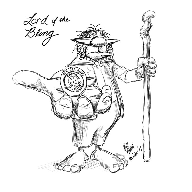
 So there I was, browsing through Instagram images when, all of a sudden, this short video pops up featuring a portable desk that you can configure in roughly a billion different ways. It's the Joocla portable laptop table. As is my custom, I press the 'purchase' button immediately before my mind becomes clouded with facts and important details. No time for that. The idea was, I would use it for my Cintiq Mobile Studio Pro so that I could have an endless number of possibilities in the angle of the screen, the height, the portability - the mind veritably raced with all the new and wonderful opportunities this item would bring to my art. When it arrived in the mail, I was surprised at how light it is. As you look at the advertisement, it indicates metal in the construction, so of course, in my mind, I'm picturing sheet metal, weld lines and maybe some rivets. Actually, the only metal portion is the perforated tray that you rest your computer on. The articulating arms are plastic or composite - not metal anyway, and feel a little bit flimsy. To be fair, my idea of flimsy is anything that breaks after a hearty whack with a sledgehammer, so I may not be the best judge in that arena. What I did like is at all the joints, there's a numerical dial so that you can move the various arms on the left and right to the same precise angle, which is handy, rather than guessing if the left and right matches. Without those dials, you could be at it for a while . I maneuvered the arms to right about where I thought would be the best angle for drawing - sort of like an easel. I took out my Cintiq and gently rested it into the metal table surface. Uh oh. Problem. The 16" Cintiq is too big for the width of the table surface - the dials on the bottom of the left and right edges jut out so that the Cintiq slides right over the bottom lip, which would otherwise hold it really well. Shelly, my wife, controls our finances. I'm like a 3 year old - bright colors and shiny things captivate me and I must possess them. So as is right and proper, I have to justify my business purchases in order to avoid bankrupting us on things like robot waffle makers and on Floby self hair cutting contraptions for the dog. I might have stated with a slight degree of overconfidence that I was sure this adjustable table would work perfectly, and I'd researched it thoroughly when Shelly had asked if I was sure I needed this. Rather than admit my head is functionally more suited as a brick than as the receptacle of deep thought, I figured I'd need to find a way to make it work. Off to the hardware store I went. The first problem: - I need to extend the bottom lip of the table surface so that it will hold the Cintiq regardless of a steep angle. My solution was to buy "L" brackets, bolt them through the table with an 1/8" bolt, and secure them with a wing nut for each, I case I wanted to adjust or remove them easily for whatever reason. Next, I needed a soft surface to cover the upward side of the "L" brackets so that it wouldn't scratch the points they made contact with the Cintiq, and to keep it more secure by eliminating it's smooth, slippery surface. My first thought was some kind of thin, self-adhering weather stripping. As I walked through the aisles, I found narrow, heavy duty strips that you stick to the bottom of furniture to prevent hardwood floors from getting scratched up. The "L" brackets, as they are, needed to be modified so that that have a bit of an upward hook to hold the Cintiq, and once that's done, the excess length as to be sawed off so that it doesn't interfere with freedom of movement as I draw. All in all, I'm really pleased with the outcome. That's what I tell my wife so that the next time I see something shiny she won't grab my arm and pull me away. 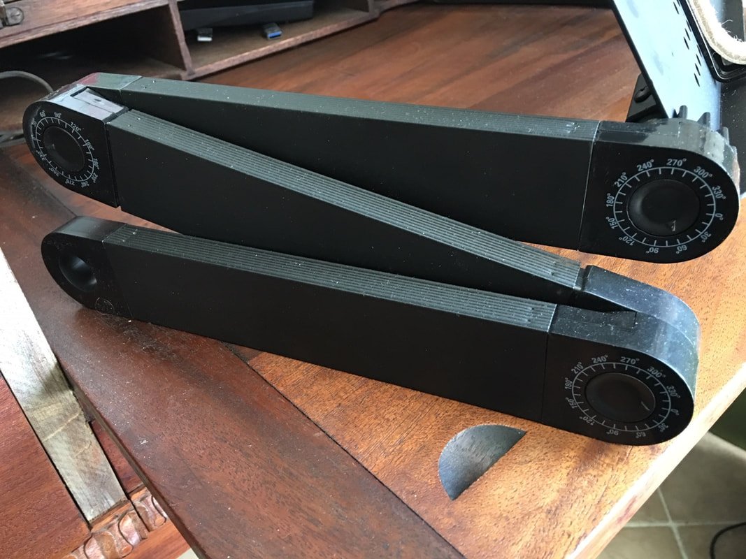 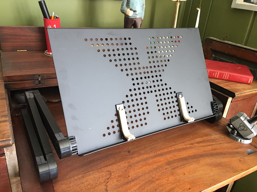 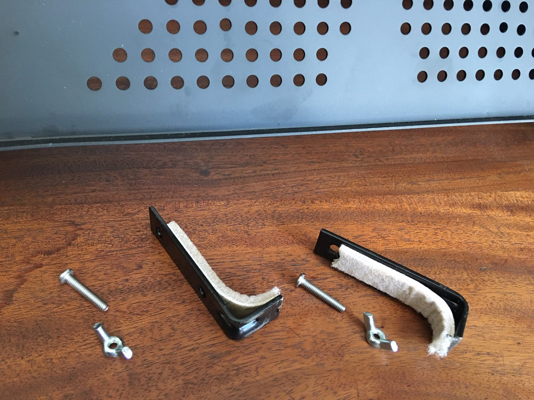 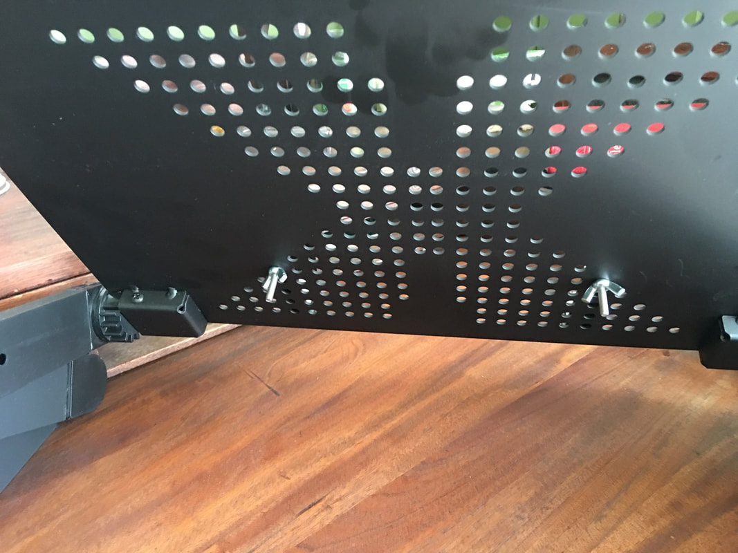  Today I finally made it to a place I've wanted to see for many years, a place close to where I grew up, and the spot where an underrated American hero made literary history under inconceivably difficult circumstances. My youngest son and I visited the Grant Cottage on Mt. McGregor in the Adirondack foot hills just north of Saratoga, New York. As we ascended the mountain in my truck, we passed a number of boarded up buildings - large, stone buildings that seemed completely out of place. Just prior to reaching the crest, we came to the Grant Cottage visitor center where you pay a modest $6 per adult for entry. As we exited the building, I saw a walking path that sloped downward and what appeared to be something of a clearing though a wooded area. We decided to check the footpath first, and were rewarded with one of the most magnificent views of the Hudson Valley attainable. 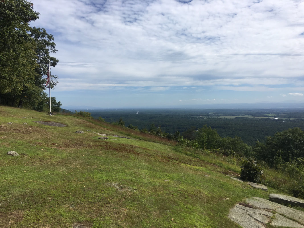 The view of the Hudson Valley looking north from the overlook a brief distance east of the Grant Cottage  My youngest son Thomas standing in the same spot where Ulysses S. Grant took in his final view of the magnificent Hudson Valley. 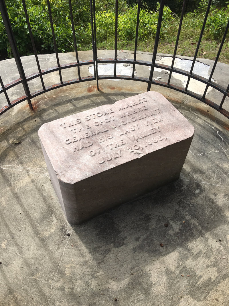 "This stone marks the spot where General U.S. Grant had his last view of the Valley July 20, 1885." 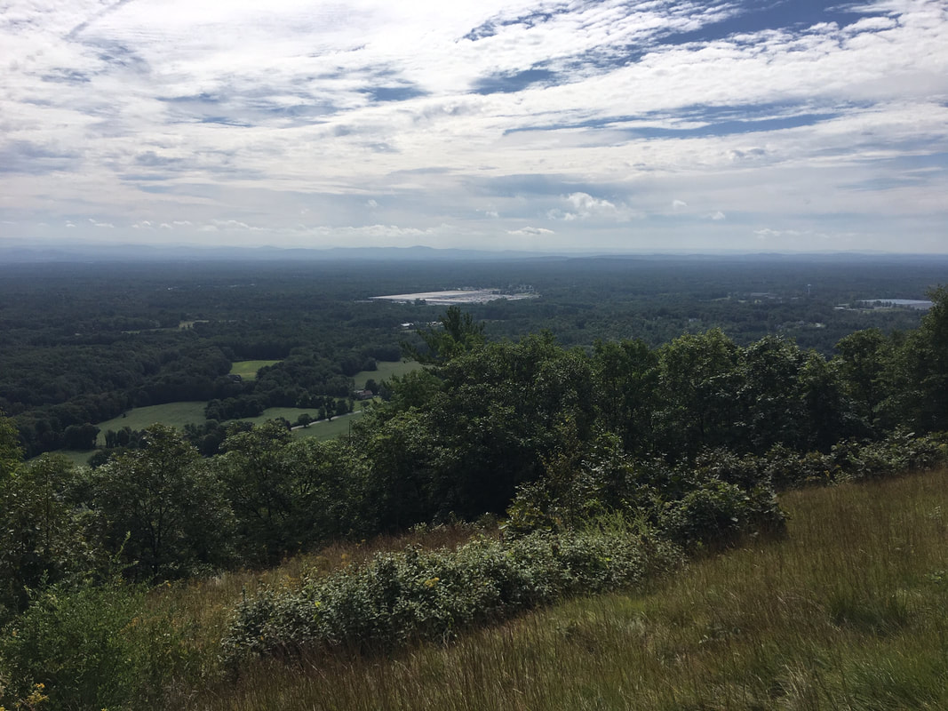 View of the Hudson Valley looking south east. After taking in the magnificent views, it was time to visit the cottage. I had been under the misperception that General Grant and his family occupied the cottage for its solitude and quiet so that the ailing General could extend his limited days in cleaner air and relative comfort. In truth, the cottage was part of a much larger resort called Balmoral. In fact, the General would sit on the front porch with a pad and paper working on his memoirs, and his family had hired a veteran to stand at the foot of the porch to prevent a steady flow of resort-goers from incessantly pestering him. General Grant, however, true to his honorable form, wouldn't permit anyone to be turned away. The resort, after the passing of the General, fell onto hard financial times, and burned in a suspicious fire, after which the owners were well compensated in insurance money. 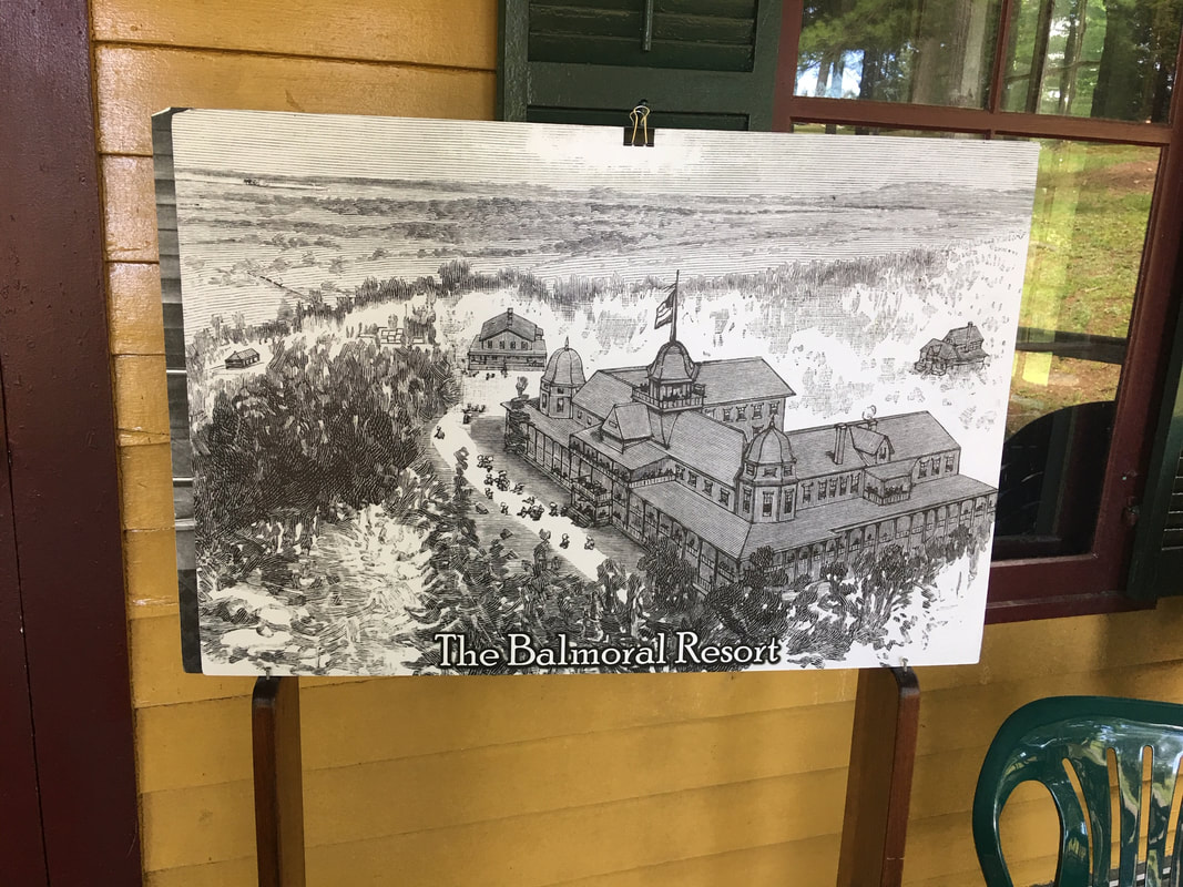 The Balmoral Resort with Grant Cottage just beyond it, center left. As we parked the truck, we were struck by the completely out of place prison fencing and guard towers which lined the back end of the Grant Cottage parking area. Such a serene, historic site juxtaposed with a now-closed, but modern and imposing prison facility - a large one at that, now all boarded up and apparently unoccupied. 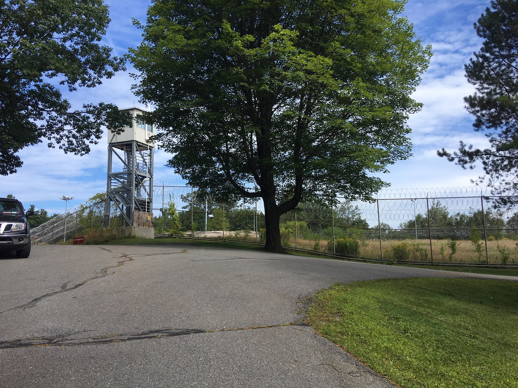 The now-closed prison facility marking the rear edge of the Grant Cottage parking area. Finally, time to approach the cottage. The first thing we notice is how beautifully situated it is amid old-growth oak trees on a gentle down-slope. The cottage itself is perfectly preserved, and as we were to find out in the course of the guided tour, it is truly a time capsule as had been intended the moment the General died. Our tour started on the front porch very close to where the iconic photos of the General had been taken, as he sat in his wicker chair composing his memoirs. 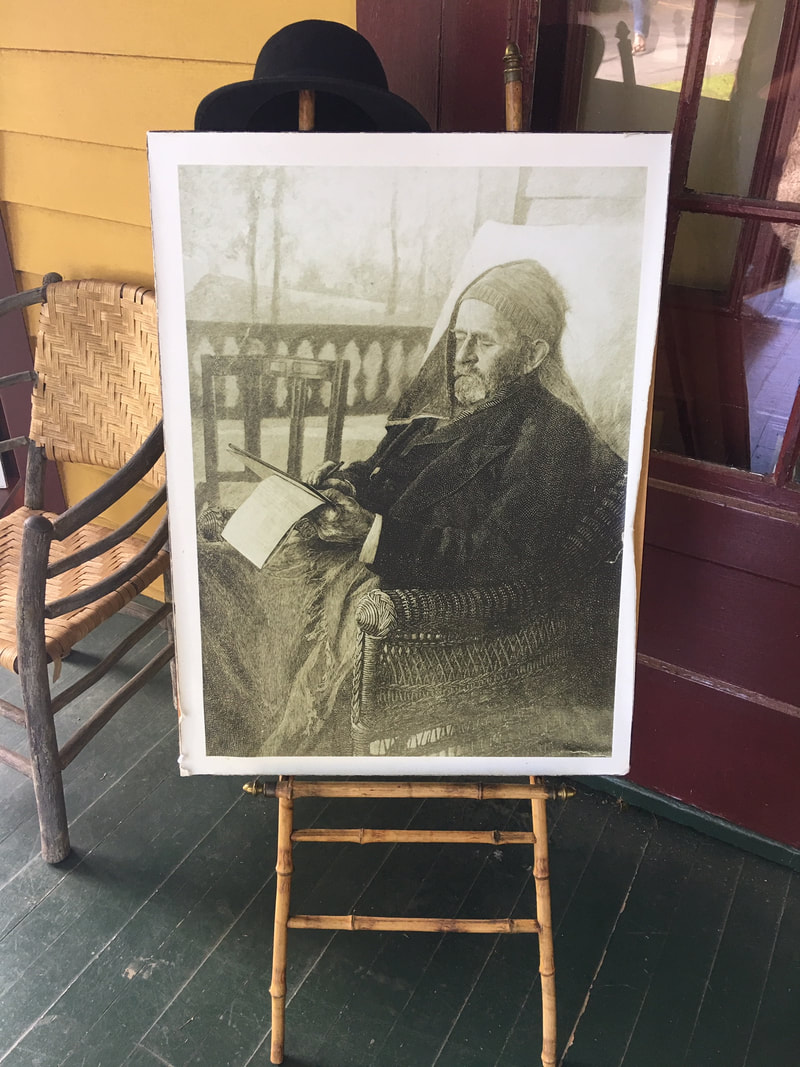 One of the last photos taken of General Grant, writing his memoirs a mere days before he died. The first room we entered had been used as an office by the Grant family as it conducted its affairs during their 6 week stay. The artifacts and room are original, with the exception of the documents laid out on the table, which are facsimiles of the originals. I was surprised to learn that the cottage had actually been lit with electric lights at the time of the General's stay - at least until 10:00PM. After that, the guests would have to sacrifice the luxury of their single filament electric lights as the sounds of the generator were so loud it would prevent the guests from sleeping. Interestingly, the General's beloved wife Julia, continued to visit the cottage after her husband's death, and signed the guestbook in the below photos. 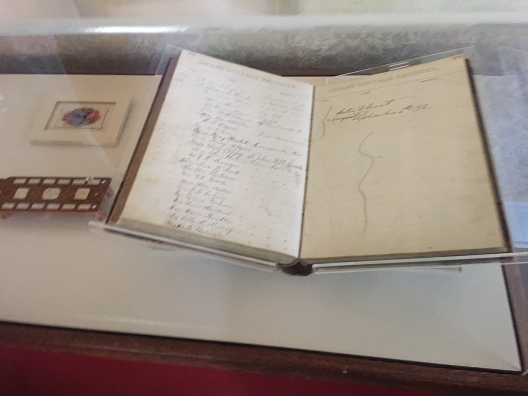 The guestbook signed by Julia Grant, dear wife of the General even in the years after his death. 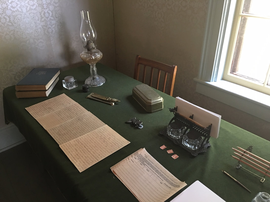 The room used by the Grant family to conduct its business during the course of its 6 week stay at the cottage. The next room we visited, adjoining the office was one of the two most commonly used by the General during his stay. Due to his increasingly painful condition, he was forced to sleep on two leather chairs pushed together. These chairs are original and were reupholstered some 70 or 80 years ago. On the wall is a chest the General's eldest son had constructed to house items specific to what he knew would be an historic time and place. Within the chest are the General's toothbrush and other toiletry items, his top hat, which he is seen wearing in one of the following images, along with nightshirts and medical items used in the course of his treatments. Most interesting, an original large bottle still containing the medicinal contents used in treating the General's painful throat cancer - cocaine water, which would be sprayed into his mouth. 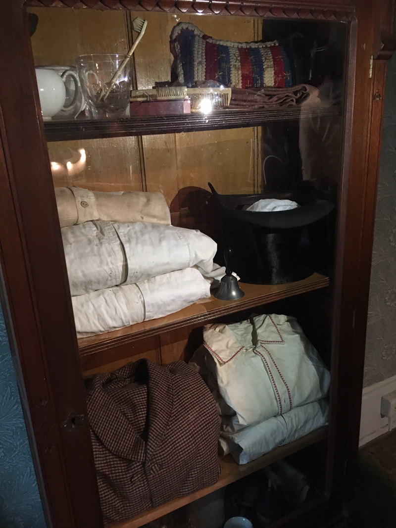 The chest purchased by Grant's eldest son to house the most personal items of his final days: toothbrush, nightshirts, medical objects, and the top hat he was photographed wearing on the porch within just a few days of his death.  The bottle of cocaine water exactly as it had been left at the time of the General's passing. 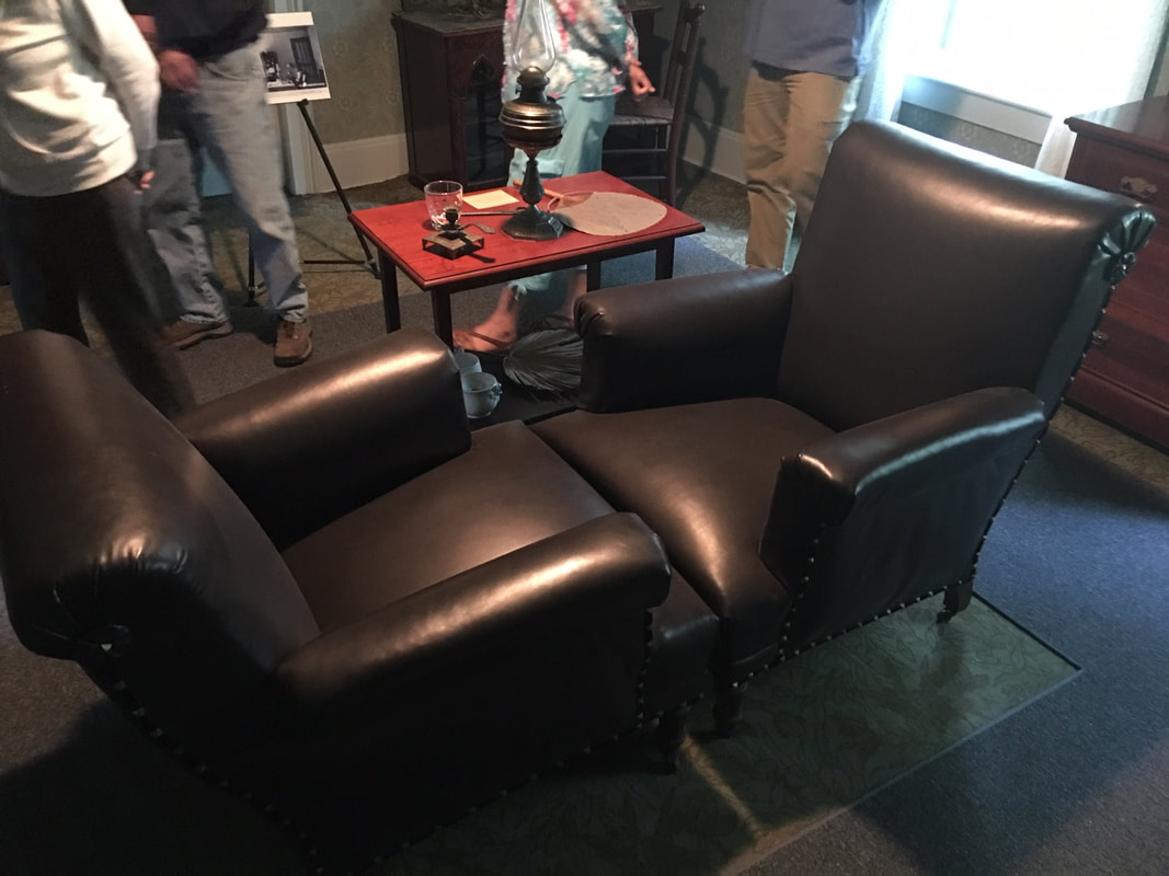 The two chairs the General slept on when reclining in a bed became too painful until his last days. These chairs were reupholstered once since the General's death. The next room, the last in the tour, was also the last in the General's life. This was the room in which General Grant died. The artifacts are original and poignant. The elegant clock on the mantlepiece was stopped at 8:06 by his eldest son, the time of the General's last breath, and has never ticked another second of time since. The bed in the corner is the bed the General died in - a fascinating 'cabinet bed', which, when stored, appears more like a large writing desk. The wicker chair on which he spent his waning hours on the porch writing his now famous words, sits at the foot of the death bed with an original funeral wreath on the seat. At the opposite end of the room Is a small table upon which rests a death mask of the General along with a card containing his words - what may have become an unfulfilled dream of his - a lasting national unity which, sadly, would no doubt be a bitter disappointment to all those who fought and sacrificed to bring us all together if they could witness the national discourse today. 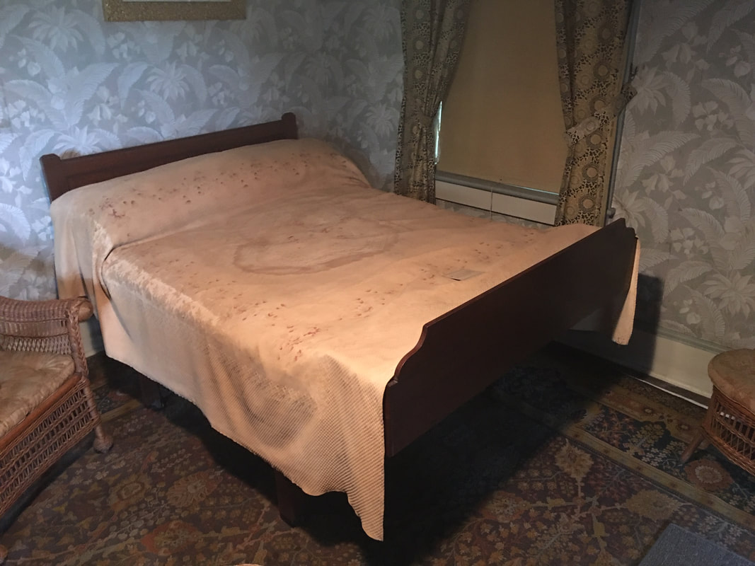 The bed on which the General died. 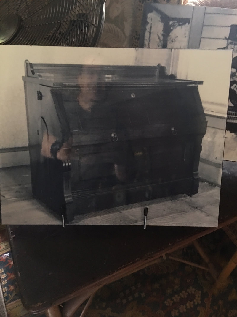 The General's 'cabinet bed' as it would have appeared when stored. 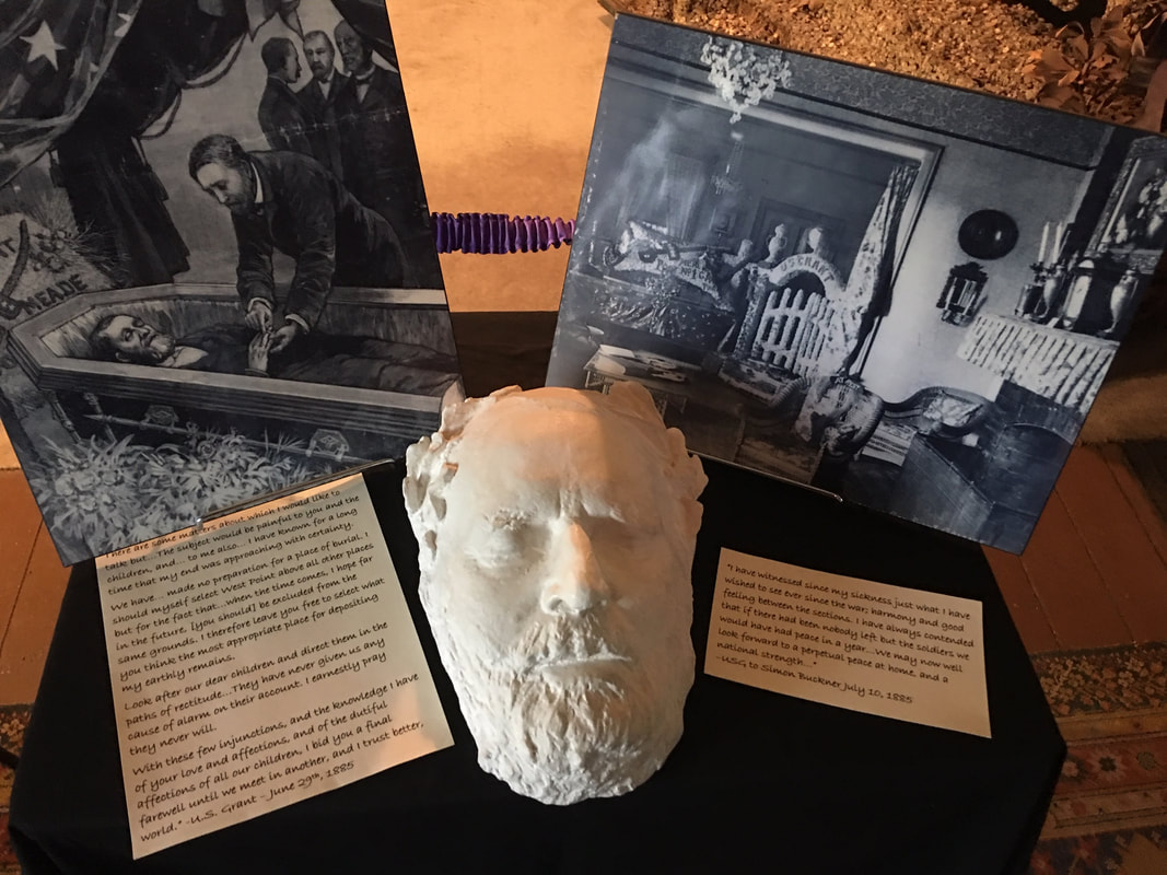 General Grant's death mask. 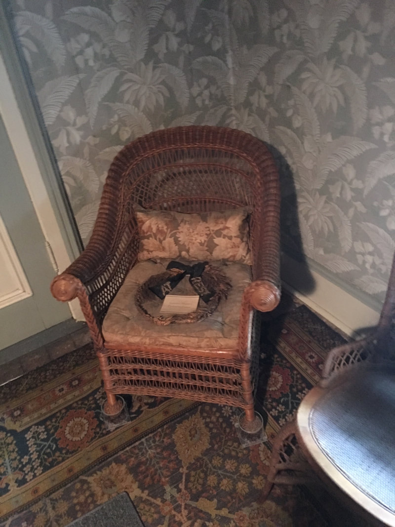 The wicker chair which had been situated on the porch of the cottage, and upon which the General would spend hours a day hand-writing his memoirs. 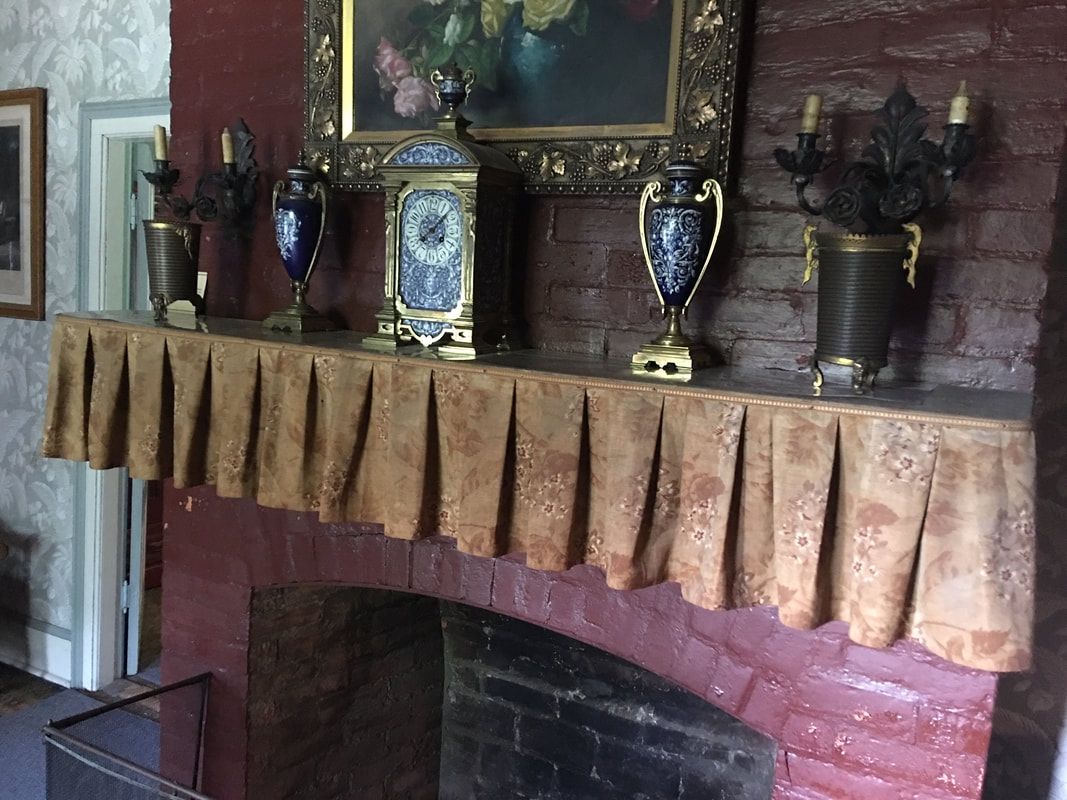 The clock, stopped at the time of the General's death: 8:06 in the morning.  The vision of a man who sacrificed much to reunite a country torn apart by the evil of slavery and opposing ideologies. I wonder how the General would consider our country today, if he would find us worthy of the sacrifices made by so many of the soldiers he cared for so deeply.. 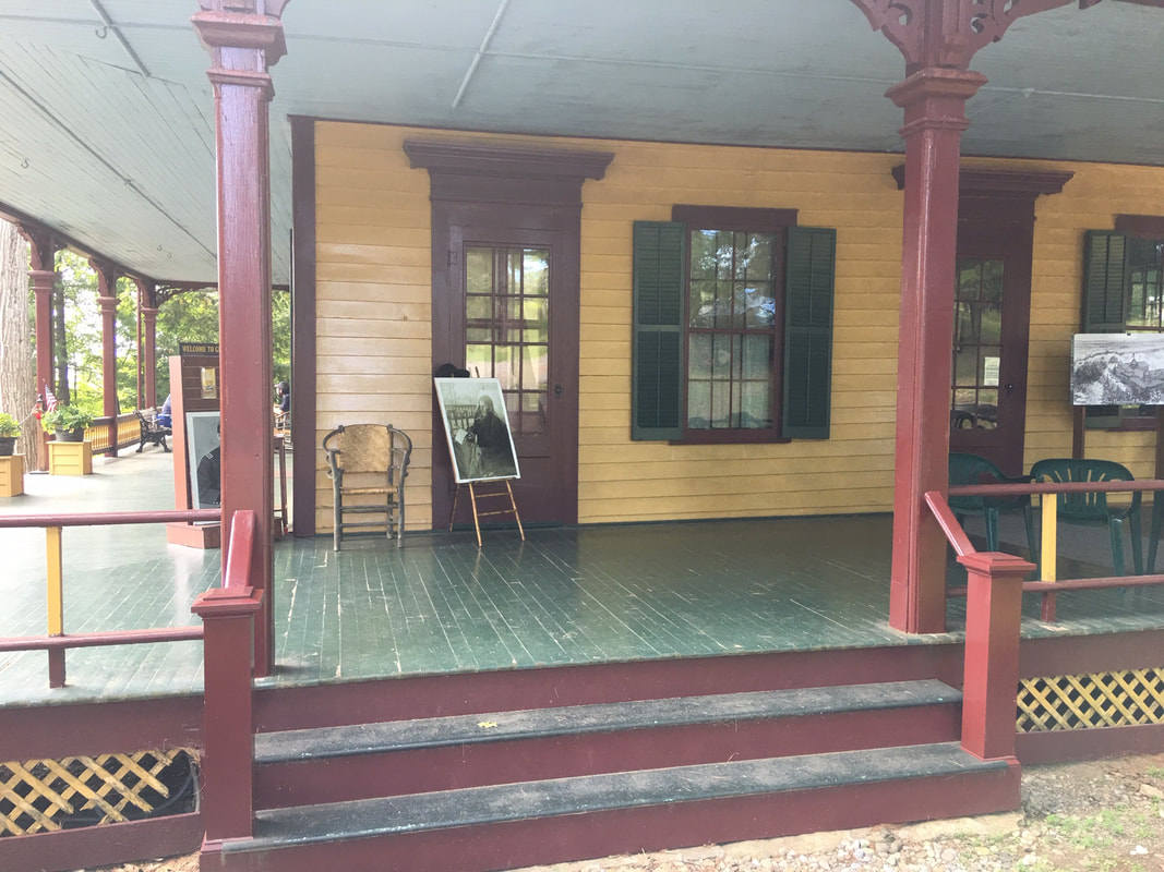 The little corner of the porch where the General toiled away recording the story of his life. I spent all of my adult life in the military which, shockingly, offers little in the way of art education. I've been very fortunate to have been able to gain the ground I have as a cartoonist, but realize how far behind the power curve I am when it comes to understanding basic concepts like color theory, values, and perspective, among others. To tackle that, I've purchased a number of courses and subscribed to some online art instruction sites. I can say in all honesty, from those I've listed below, the experience has been very positive. The knowledge and professionalism of the instructors has been impressive, and I've learned I great deal. Best of all, these are very affordable (ranging from $15-$150 for a course to a monthly fee averaging around $30) when compared to tens or hundreds of thousands of dollars to attend an art school. At any rate, here's the ones I've purchased from or subscribed to in no particular order:  Aaron Blaise's CreatureArtTeacher.com - I discovered Aaron Blaise via YouTube and have been an avid fan ever since. His live drawing videos are absolutely phenomenal and inspiring, which led me to checking out his website. He has a wide variety of course selections covering everything from digital painting in Photoshop, animation, watercolor, to animal anatomy and perspective. I've purchased a number of his courses, all of which have been very helpful. I also purchased some of his Photoshop brush collections and use them regularly for some of my own work.
SVS Learn - Like Aaron Blaise, I discovered SVS Learn by watching Will Terry's YouTube channel about the art and business of being a children's book illustrator. He's immensely talented and his discussions are engaging. The variety of courses available on the SVS site allows for a wide range of possibilities for those of us in learning mode. Even though the primary focus is children's book illustration, there's something there for every working artist - even licensing industry talks. As with Aaron Blaise, you can purchase individual courses or pay a monthly subscription fee which allows access to all available products. Schoolism - Probably the most impressive, thorough, and extensive online art courses available, at least from my somewhat limited experience. Created by the immensely talented Bobby Chiu, Schoolism has a heavy emphasis on the animated film industry, but the courses are so thorough, and the instructors so knowledgeable, you really can't go wrong with whichever one you choose. I've had a subscription (about $30 a month) and it's worth every penny - a bargain in fact. The degree of detail covered is definitely university-level, and best of all, the instructors provide assignments to check your level of understanding, and critique the artwork you turn in, If you're serious about upping your artistic game, this is the site for you. Ctrl+Paint - If you're looking to improve your digital painting skills, but your budget has no room left for any extras, this site is for you. Many of these professional-level courses are absolutely free, and those that aren't are still very inexpensive. I've purchased a number of them and have had nothing but positive experiences. While I'm sure there are many other art instruction sites online, these are the ones I have personally purchased from or subscribed to and can speak about from experience. If there are others that you'd like to recommend, (or advise against) please leave them in the comments below. As some of you may know, and I suspect most don’t, my path to becoming a cartoonist wasn’t exactly predictable. Least of all by me. I was a laborer, a stockbroker, an operator in the Navy’s Special Boat Teams, a special agent in law enforcement, and finally, a cartoonist. 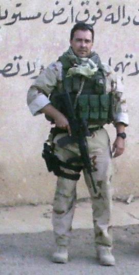 Me in 2006 in Iraq. 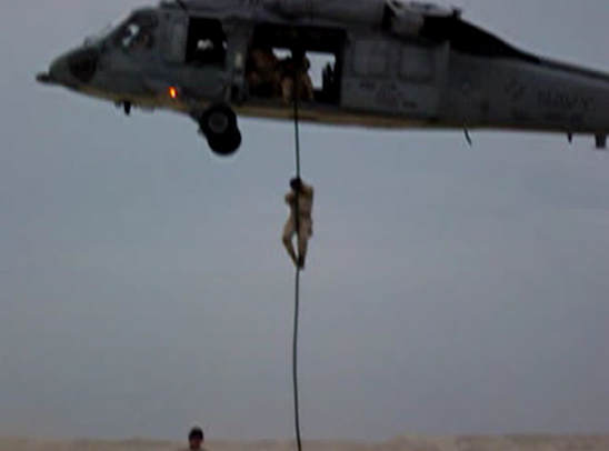 Me fast-roping from an SH-60 helicopter just before dawn in the Middle East.  Moving tactically with a glass of red wine in choker-whites in 2013. Along the way, I learned a lot of valuable lessons that weren’t taught, at least to me, in school. I had the opportunity to work with and observe Ivy League financial wizards, Navy SEALs, and brilliant detective minds in law enforcement. My own experience as a Navy SWCC, (here’s a video featuring special forces training featuring SWCC – Making the Cut – SWCC) and the challenges encountered in making it through selection and training taught me a lot. From all of these things I found patterns and similarities in achieving success which I apply to my own career as a cartoonist. To be sure, I’m not where I want to be yet, but the key points below have brought me far closer to the goal. I’m sure there are other paths, and other truths, but this is mine, and I hope you find value in it. Be crystal clear about your mission It’s difficult to achieve anything if you don’t know what it is you want, and cartooning is no different. Are you seeking syndication? Is it your intention to follow the path of great webcomic trailblazers? Magazine cartooning? Animation? Humorous illustration? Self-syndication? Licensing? There are many areas in the field, and by knowing where you want to go, you can efficiently apply the most critical and valuable resources to them: time and creative energy. Be clear enough in your intent to be able to articulate it and write it down. By identifying the direction, you will more easily detect and benefit from the paths of those who have gone before you. It’s not to say you can’t seek success in more than one of the above, and perhaps all of the above, but time is a precious thing, and few of us have it in abundance. Expending your precious resources in a scatter-shot way, hoping you’ll strike something will likely result in disappointment. Know your target.  Know where you are so you can determine the distance that needs to be traveled This is among the toughest, but most important elements. Self-honesty about where you are as a cartoonist is not an easy thing. It involves stepping outside yourself, your ego, and being objective about your art and writing. If you are moving toward syndication, does your work stack up well against what you see in the newspapers? One of the ways you can find out is by seeking input from industry professionals – both your fellow cartoonists, and those who are the decision-makers in the markets you’re trying to crack. Send samples and ask for feedback. And be prepared to receive feedback – it can sometimes be uncomfortable. But remember your mission – is it to seek accolades and adoring remarks, or are you genuinely trying to succeed? Knowing where you are and how far you have yet to go allows you to create a considerably more accurate map to success. And you can arm yourself with sufficient tools and resources to see you through. Study the terrain Each area of the cartooning industry has it’s own unique characteristics. For instance, if you seek success in magazine cartooning, you’ll approach it differently than you would syndication. And syndication requires focus that won’t necessarily bear fruit in licensing or animation. Knowing the terminology, history, players, success stories and decision makers will lay out the map clearly, and will allow you to avoid the impassable climbs, pits and roads to nowhere. You will be able to find the path of least resistance and move far more quickly than if you amble along, hoping to stumble on the right path. Navigate, don’t guesstimate. Be honest with yourself, acknowledge your deficits so you can focus on them and bring them up to where they need to be Similar to knowing where you are, self-honesty is like having a key to the supply room. If you know what you need and where to get it, you can supply yourself with it. And in the age of Youtube, Vimeo, and individual instructional sites by the thousands, there’s absolutely no reason to operate in a deficit position. If your art needs something more, there’s an abundance of help waiting for you to show up. If your writing isn’t up to snuff, the free resources out there to fix it are a click or two away.  Learn to love learning The rate of change in today’s world is positively astounding. Whether it’s technology, society – even markets, things are dialed up to eleven. In order to prosper in a changing environment, we have to take on new information, new skill sets, and sometimes new resources and equipment. If you look at it as a burden, you add an anchor to your future that you’ll have to drag along, slowing you down to a crawl while others divest themselves of that mental attitude and seek the opportunities in learning. It broadens their creative horizons, exposes them to new capabilities and skill sets, and subsequently new markets. Accept no excuses from yourself – discipline, discipline, discipline This is another area where self-honesty is critical, and honestly, an area where I sometimes struggle. In today’s world of social media and infinite distraction, staying on task is no easy feat. The biggest challenge for most is time. Time to write, time to draw, time to learn, time to submit, time to market, and on and on. I’m sometimes approached by aspiring cartoonists who wish to jump into the art because they think it’s a path to easy money. They think, because the art looks relatively simple, and because they’ve told a joke or two at a party, that’s all the ingredients required to make it as a cartoonist. We know different. What we do looks simple because we’ve worked hard to make it look that way. And we’ve acquired that skill by investing the time and resources to perfect our craft, understanding that this is a highly competitive, professional vocation. Time – it’s the one commodity that’s most precious and in greatest need of being used wisely. Every minute, if we fully appreciate its value, should be used in a way that advances our mission. Many have said to me, ‘I just don’t have the time.’ I catch myself saying the same thing sometimes, and I have to purge that thought as quickly as possible. If you want something – really want something, there’s time. Right after my second son was born, I had to figure out how to continue to create cartoons, while balancing the needs of my family. After careful consideration, it came to one obvious answer – I just had to get up earlier, and in this case, that meant 4:00 AM. It takes a good deal of discipline to make that change, but which is more costly, changing the time on your alarm clock and walking away from the TV or Facebook a little earlier, or surrendering your dreams and aspirations? Appreciate the value of your mission, discipline yourself to do what needs to be done, consistently over time, to get you there, and hold yourself accountable – no excuses. You will own the outcome whether it’s positive or negative, so it’s worth building the discipline muscle to get you there. And that means now. Not tomorrow, or next week, or when you think things might lighten up. Now. New Year’s Resolutions be damned. Strategic and tactical analysis Strategy and tactics. Macro and micro. Big picture and little picture. As I’ve mentioned earlier, things change, and it’s happening at an exponential rate. Since things change, we need to step back periodically and reassess our situation, and where we fall on our strategic map. For instance, say you’ve learned new skills, which have opened up new possibilities and markets. Maybe you’ve learned vector art and have some logo design opportunities come your way. Or you’ve been approached to illustrate a children’s book. Or your magazine cartoons might make a good syndicate submission. Whatever the case, it’s wise to take a step back now and again and make sure your map remains accurate, or that the mission might need updating, requiring a reallocation of time and resources. In tactical terms, maybe you see an opportunity that requires a slight adjustment in your approach. Or you need to temporarily change directions to better position yourself for your ultimate goal. Like most things in life, success in art and cartooning is comparable to a chess game. Think about your immediate moves, step back and stay up to date with your overall strategy, and by all means: Be Flexible It’s widely understood that these times, they are a’ changing. If this was a hundred or so years ago, and we were the best wagon wheel craftsmen in the world, the outcome would still be the same – our market is now driving off the assembly line in Model Ts. As conditions and markets take their own paths of least resistance, we need to take a look at where we are, what we’re doing, and our current resources and see if they still add up to mission success. If they don’t, what do we need to change to get back on track? Often, it won’t require a radical shift, just a mild adjustment.  When the going gets tough … Success in most worthwhile endeavors will require perseverance, some fire in the gut, and the ability to pick yourself up off the ground, dust off, and move forward when you get tripped up. As most experienced cartoonists will tell you, rejection is an abundant part of your working diet. It’s not personal, it’s not a rejection of you as a human being, and it may not even be a rejection of your work – it might just be bad timing. Whatever the reason, understand that your mission is valuable enough to take the lumps when they come. In time, you’ll learn to shake them off with indifference, unless there’s a learning opportunity contained therein. Lessons learned When a military unit returns from a mission, it goes into self-analysis mode; what did we do right? What did we do wrong? What can we learn from this? How can we capitalize on this experience to make ourselves better, more effective? So it is with cartooning. You made a submission and you got rejected – was any feedback included? You become aware of another cartoonist who is successful in your target market – are there discernible differences in what he’s doing or how he’s doing it that you can learn from? Own it This is a big one. In the military, we lived by this basic tenet – you own it. Succes is yours, and so is failure. If you don’t get what you want, the answer lies with the one you see in the mirror. There will always be outside forces that will not be acting to your advantage. That’s life. We can hang our hats on that fact and use it as an excuse for walking away from our mission, or we can embrace our personal responsibility in our outcomes and remain in the fight. I’ve heard it said that Babe Ruth, the Home Run King, was also the Strike-Out King – he swung more than anyone else, and actually missed more than he hit. But he knew that if he let the strike-outs define him, it wouldn’t be worth the effort to step up to the plate again. I believe that’s true for us too – own the outcome, learn from it, and don’t let the misses define you or your potential. Spread the wealth For me, this is one of the biggest rewards – getting to share with and assist those who come after me. I consider myself so fortunate, and therefore so grateful to be able to do this, to be a cartoonist, and to have people who enjoy my work. And I see how others are dedicating themselves and working so hard to succeed in this endeavor. Before me were great people who selflessly offered me guidance and the fruits of their hard-earned lessons to benefit me. It’s a great joy to be able to share my experiences and offer that same hand to those who may need it. As you stack up your successes and achieve career milestones, I hope you’ll stop to look around, see others who might be struggling and reach out to pull them back onto their feet. It’s impossible to replicate or quantify the value of that feeling in monetary terms. To conclude, I find it most fitting to use the motto of my SWCC brothers: On time, on target, NEVER QUIT! 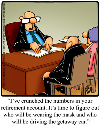 In Part 1 of our series on coloring Spectickles cartoons, we talked about the basic formatting and ended up with a completed black and white Spectickles cartoon. That's necessary before we move on to the next section - this section, where we discuss what layers are and how we use them in applying color to our cartoons. First, what is a layer? The way I think about them is they're like a clear piece of plastic that you're going to lay on top of our black and white cartoon. What we do on that clear piece of plastic won't effect the black and white cartoon beneath it, which is something, as you'll see, we'd prefer. And fortunately, with the Clip Studio Paint Pro program, as with most other drawing programs, we can turn the layer on and off for our purposes. So, rather than keep explaining in words only, let's take a look at our screen and talk a bit more about where to find layers and how to set them up. 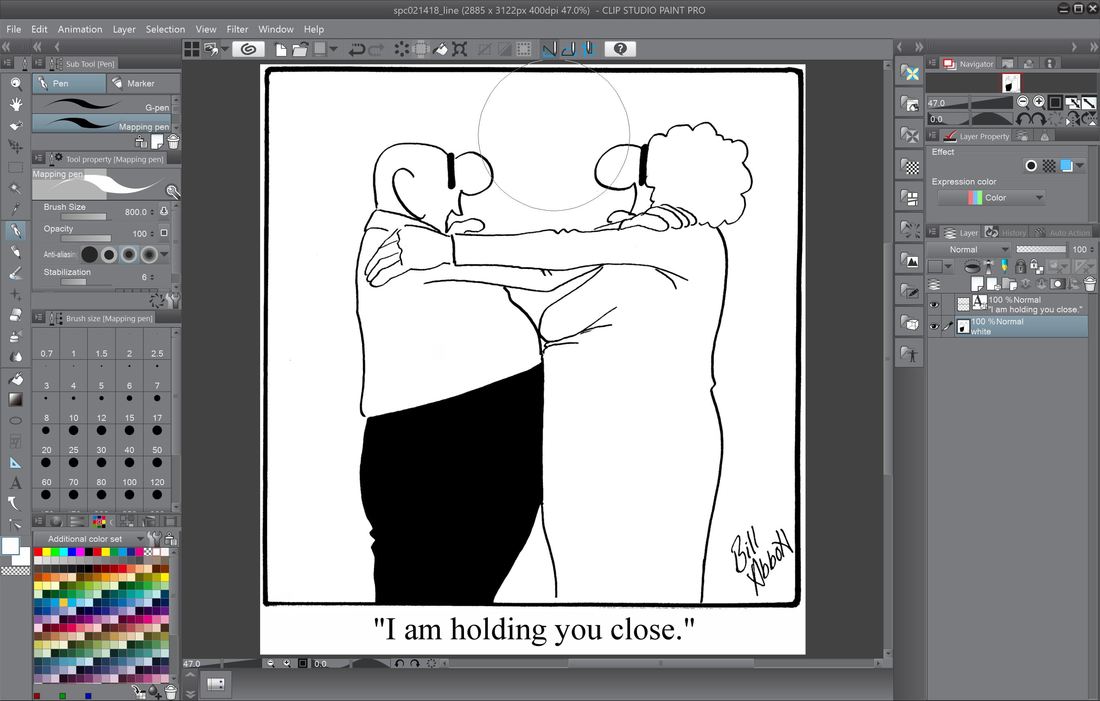 Here's where we left off in part one, with a completed, formatted black and white Spectickles cartoon. 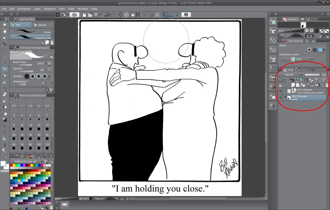 When it comes to our first steps in adding color to a Spectickles cartoons, we need to turn our attention about mid-way down on the right side of our Clip Studio Paint Pro screen, where we'll have a look at the 'layers' section.  When we left off last time, we had 2 layers - our bottom layer which contains the black and white cartoon, and laid on top of that is our text layer. And remember too, whichever layer is highlighted in that blue/green color is the active layer, or the layer that'll be affected by anything you do in the image. In the area I've circled in red - that's where we click to add another layer, which we'll do now for our color. 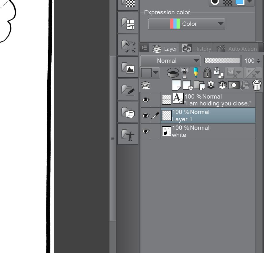 As you see highlighted, the active layer is the one we've just added, which is sandwiched between our black and white layer (which for whatever reason is just labeled as 'white' - we'll change that) and the text layer on top. 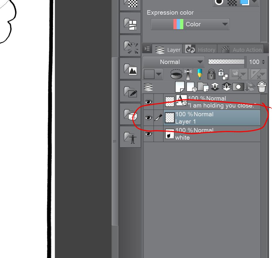 As we work with our layers, we'll want to keep them straight - we want to know at a glance which one we're working on, so it's useful to label them accordingly. In order to change the name of the layer, just double-click over where you see 'Layer 1'. 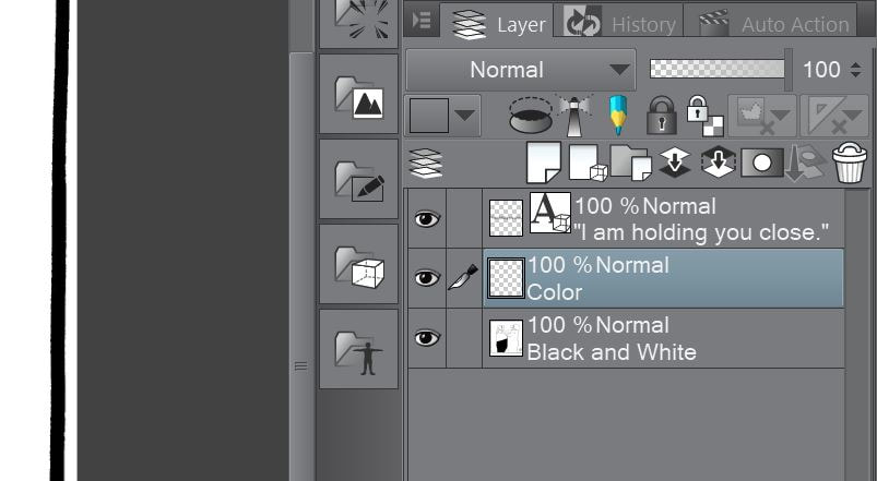 When you double click on the layer, the box will open and allow you to relabel. In this case, I've changed the color layer to, oddly enough, color, and the black and white layer to - you guessed it, black and white. Next, you'll notice just above where we relabeled our layer to 'color', it says 100% Normal - we'll need to change that to 'Multiply' so the layer interacts differently with the other layers - you'll see why in the next screen. 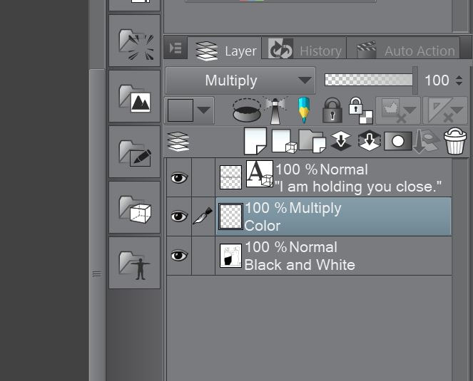 In the screen above, you can see I've changed the layer to 'Multiply' from 'Normal'. Do you see where the little lighthouse-looking thingy is next to the blue and yellow pencil icon? Just above that is a dropdown box which now says 'Multiply'. Prior to clicking on the dropdown and making the change it said, 'Normal'. So as I'm sure you've guessed already, click on that box and make the change. The reason we want the layer to 'Multiply' is that when we color, if it's on the 'Normal' setting, it'll color over the layer beneath it, so it looks like your obliterating the underlying black and white. By making the layer, 'Multiply', it'll interact with the layer beneath, so you'll still see your line work as you color.  Now that our layers are all set up, we're ready to have a look again at the left side of the Clip Studio Paint Pro work surface and tools. 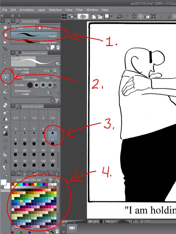 The first bit of coloring I do is laying down all the flat colors - the shading comes later. On the left of the screen, I select the pen tool, which is circled in red and labeled 2. Once that's selected, above that labeled 1. is the type of pen, and in this case, my preference in the gel pen - I just like the type of line it produces - pretty much as simple as that. 3. is the width of the pen tip in pixels. If I were drawing lines, I typically use 17, where it's set now. But to begin coloring, I start with the background and make the pen tip really wide - usually over 800 pixels since at this stage, precision isn't required. And of course, below that is our color pallet to choose from. 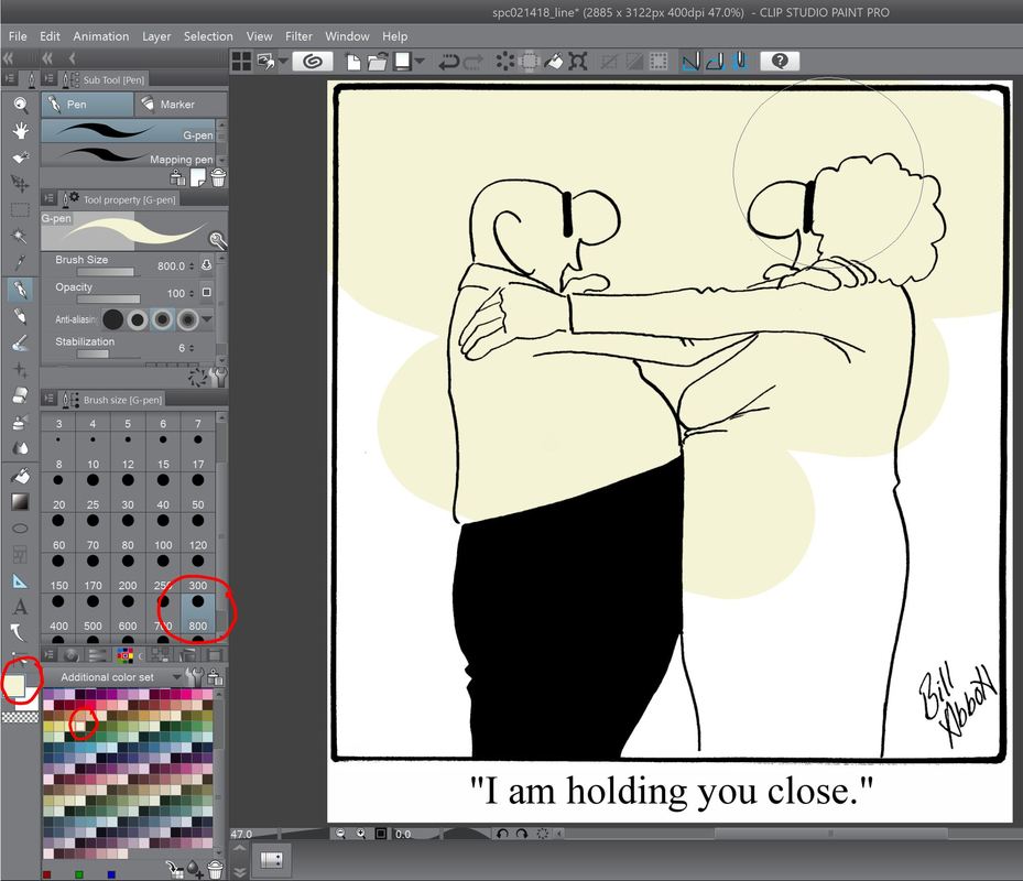 Because I want your eye to be drawn to the characters, the background color is usually pretty muted. As you can see where I circled on the left, I'm adding the color with the pen tip cranked up to 800 pixels and the color I chose is pretty bland. 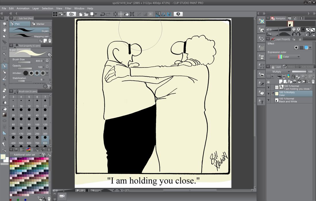 When I color the background, I'm not at all concerned with neatness - just get it done and I'll clean up all the white trim areas later. 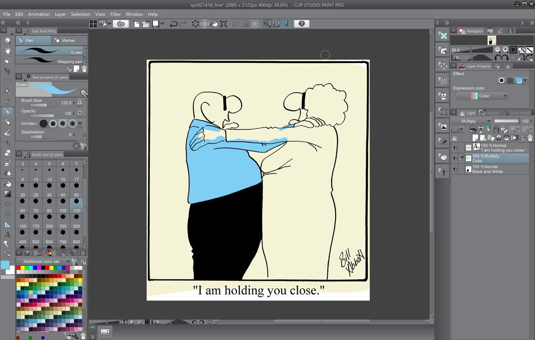 Next, I start adding color to the characters. Because this husband and wife team are the center of Spectickles, the colors I use, for the most part, should be the same to help make them instantly recognizable - the husband's shirt is always the same blue, and the wife's dress is always the same pink. 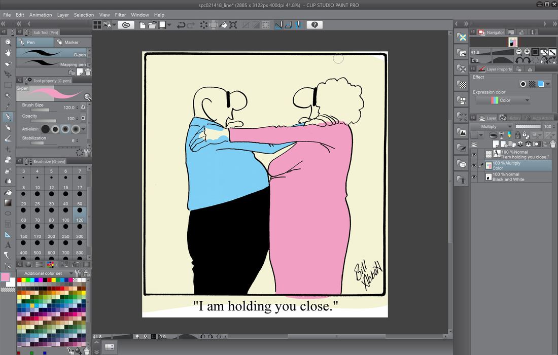 When it comes to coloring the characters, I need to be precise in the areas that terminate at another color - coloring within the lines, except in places where it doesn't matter, as you see at the bottom of the cartoon. 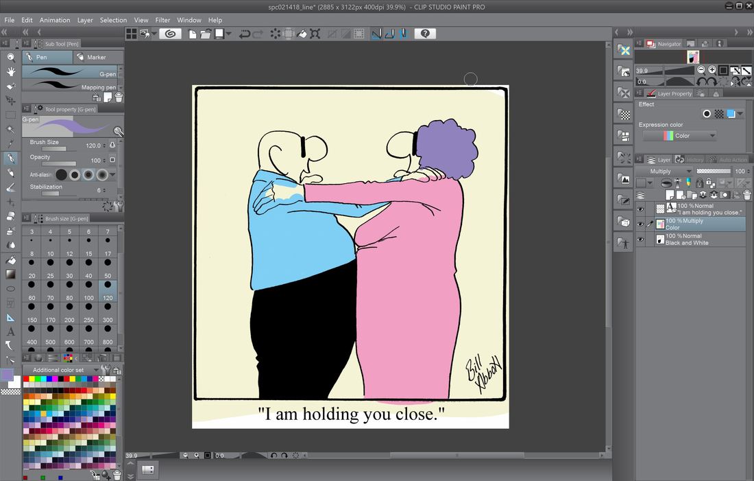 More color applied - in this case the wife's hair. See Ma - I'm staying within the lines! 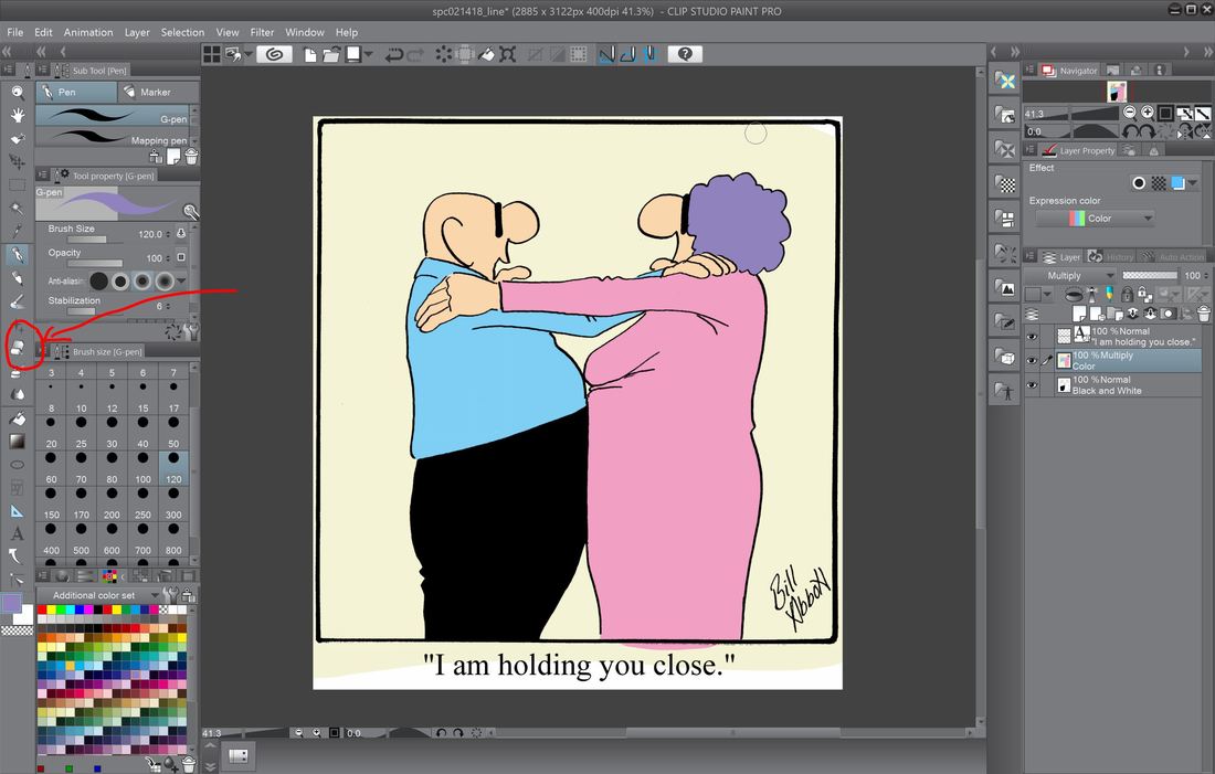 Now that all the flat colors are applied, it's time to clean up around the edges. You can see encircled in red is the eraser tool. That can also be enlarged as needed - you can see here it's currently at 120 pixels. 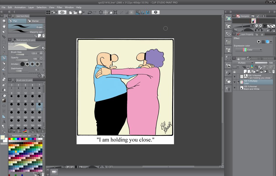 Here the flat colors and cleanup are all done, and we're ready to start some shading. 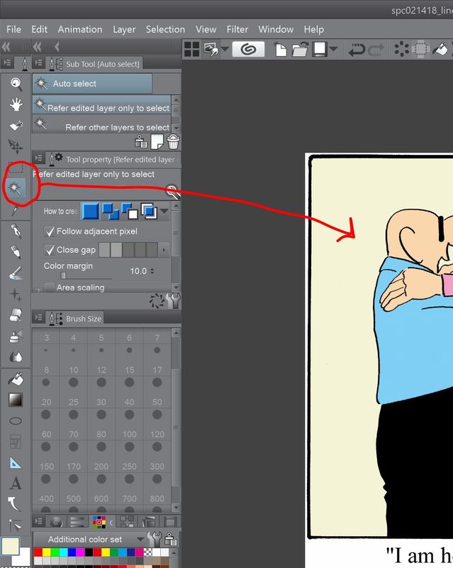 One of the really great tools available in Clip Studio Paint Pro, and other programs for that matter, is the 'Magic Wand' tool. When I'm going to apply shading, I'll click on the tool, which is circled in red above, then hover over the area I intend to color, then left click on it. When you do that, the Magic Wand will select that area of contiguous color - you'll see a pulsing dotted line around the area when it's selected, and whatever actions you take will only effect that area. So for shading, I make sure I've got the right color selected that I wish to use for shading, then move down to the next tool we'll talk about, the 'Airbrush' tool. 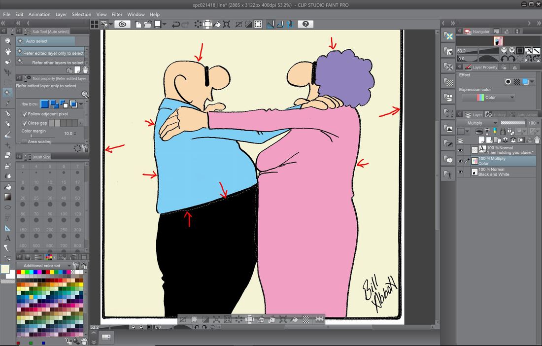 Above you can (hopefully) the active dotted line that surrounds the area of contiguous color selected by the 'Magic Wand' tool. 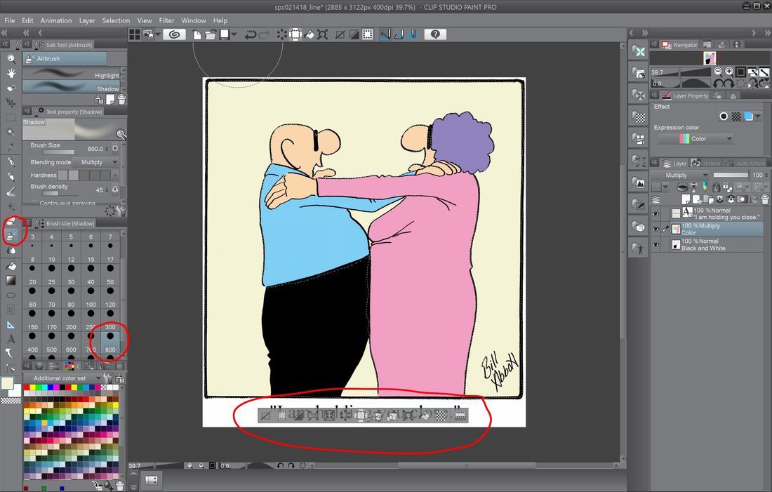 Also, when the are you've selected with the 'Magic Wand' is active, an elongated box with show up beneath the area you've selected with a group of additional tools for manipulating the image. But since they go beyond the scope of our current topic, we'll save those for another time. On the left of the screen you can see a tool that I've circled that looks like the top of a can of spray paint - that's the 'Airbrush' tool we'll use. Below that is the spray area - just like with the pen and eraser, measured in pixels. 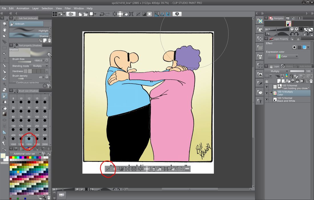 When you want to deselect the area used with the 'Magic Wand' tool just click on the left-most icon within the elongated box, circled above. 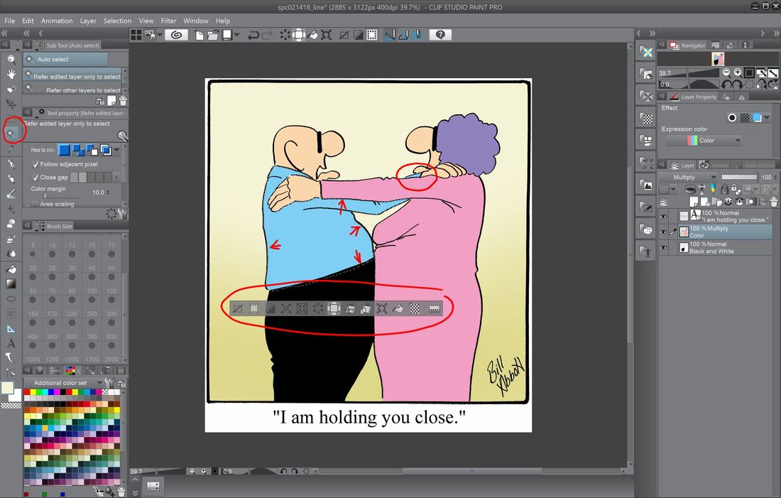 When you use the 'Magic Wand' tool, it will only choose the section of color that is contiguous. If it is separated by another color, it will remain unselected, as circled above. 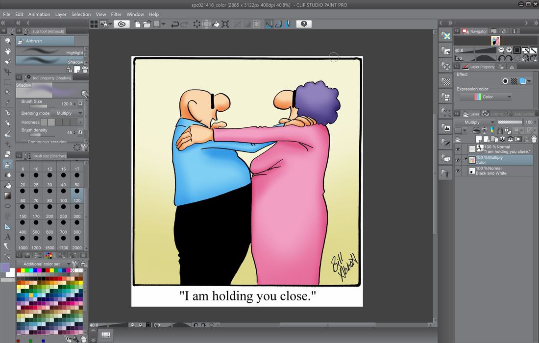 The final results of using the combination of 'Magic Wand' tool and the 'Airbrush' tool to add a shading effect to the now complete cartoon. 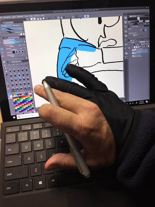 No, this isn't a poorly chosen fashion statement - it's a half-glove I use to prevent the palm of my drawing hand from interacting with the screen as I draw and color. The software is actually really good in preventing it from happening, but I don't have time to discover too late that it didn't work. 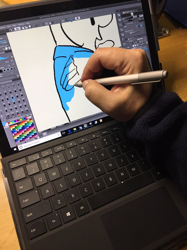 Coloring on the Surface Pro 5.  The completed cartoon. Thank you again for spending time here. Up next, the step-by-step process I use in creating the now all digital Percenters cartoons.
|
 RSS Feed