|
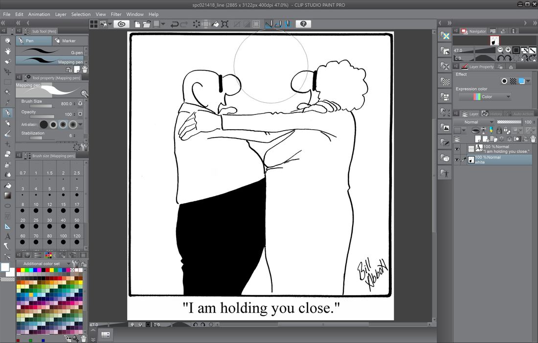
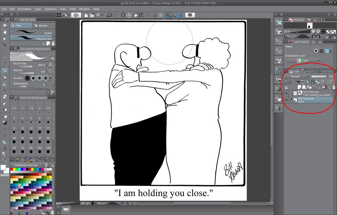
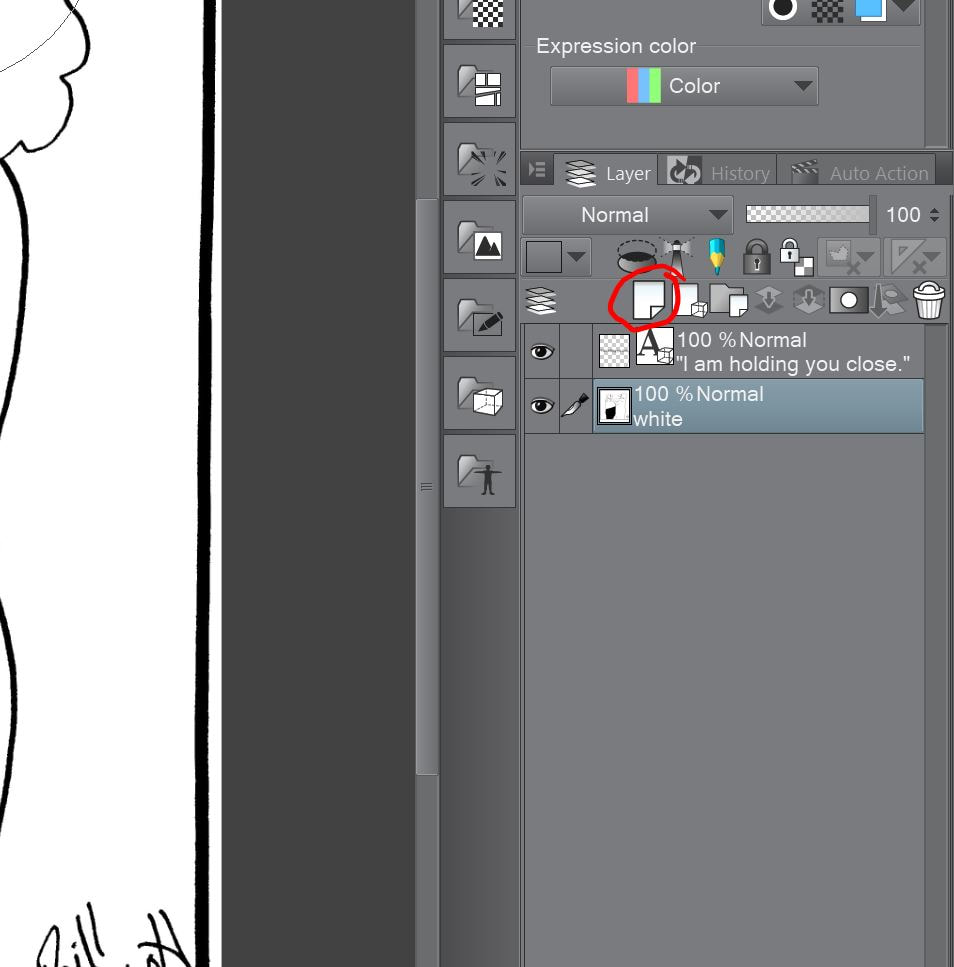
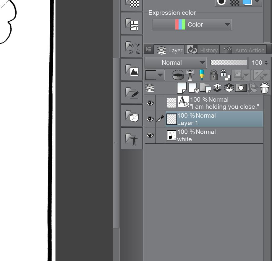
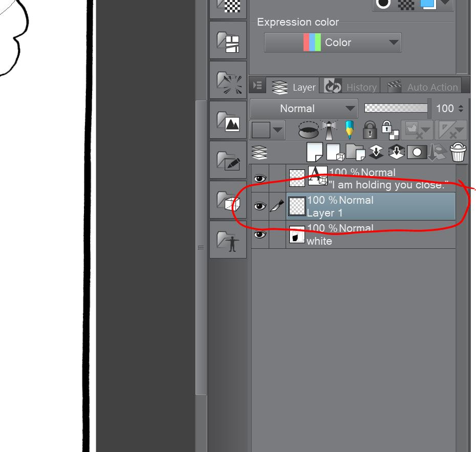
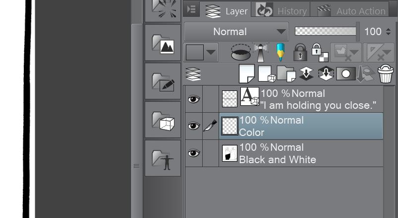
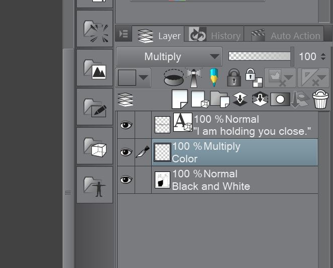
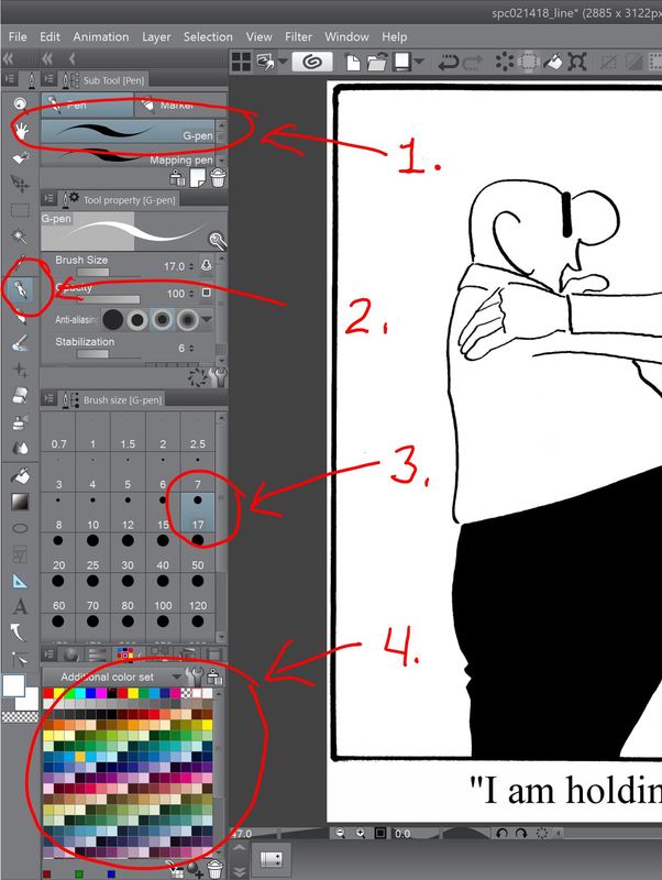
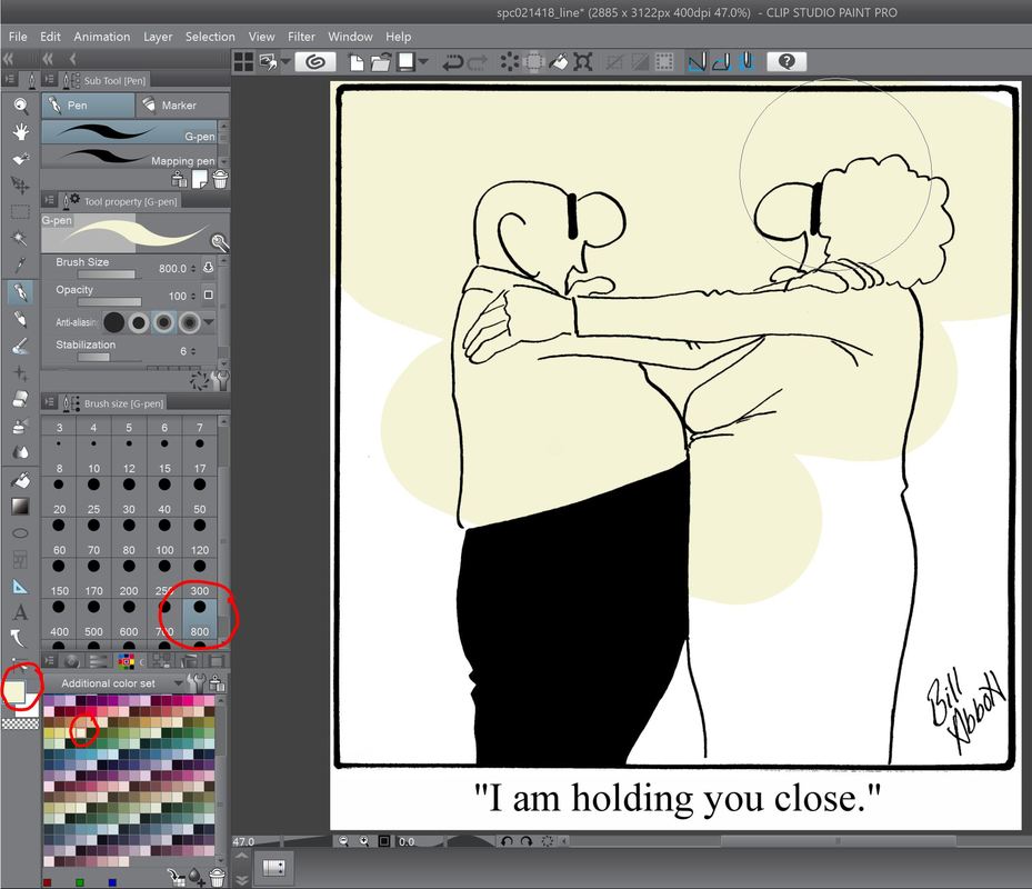
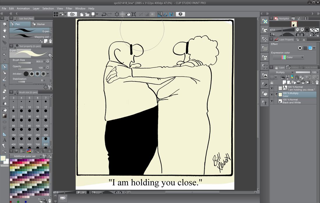
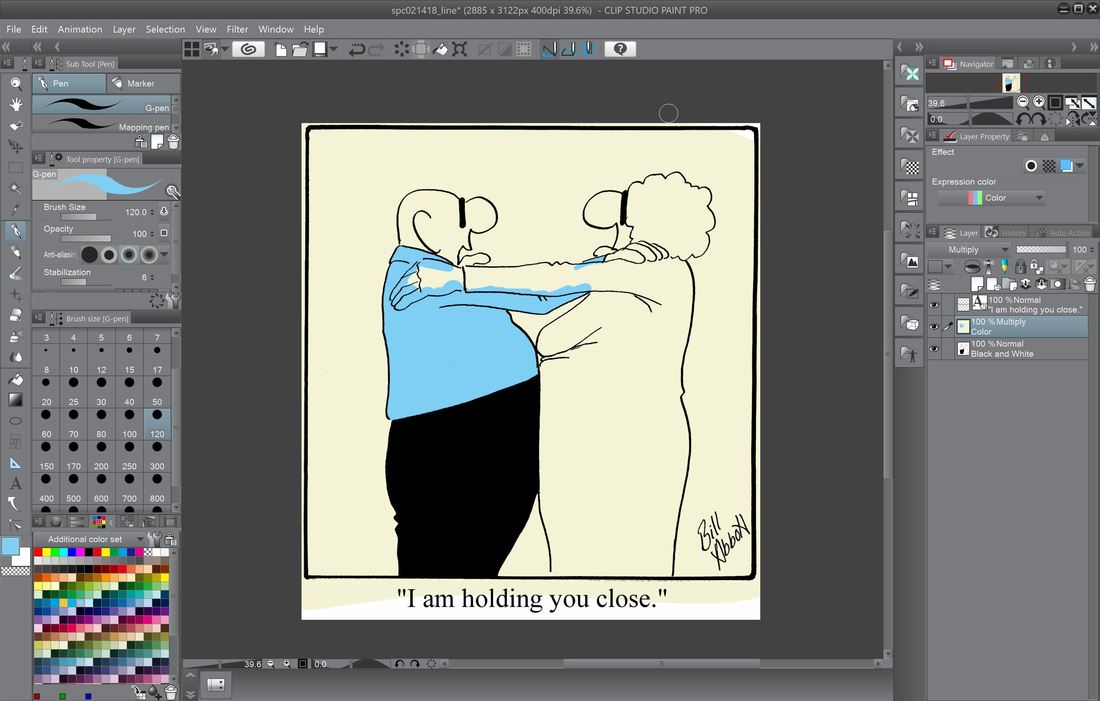
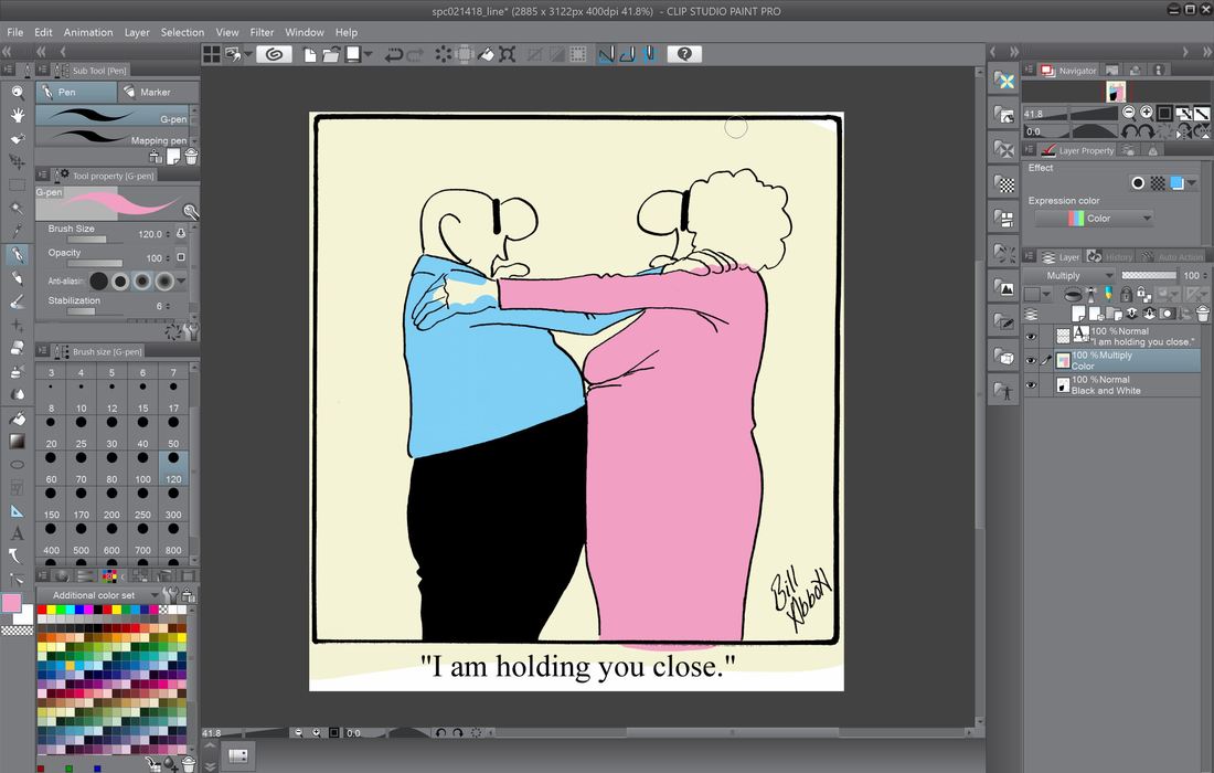
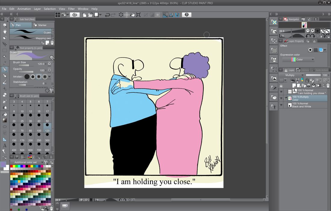
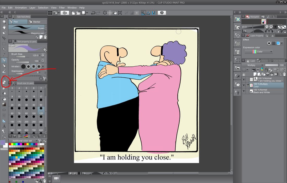
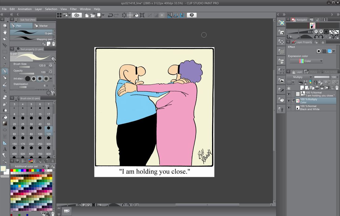
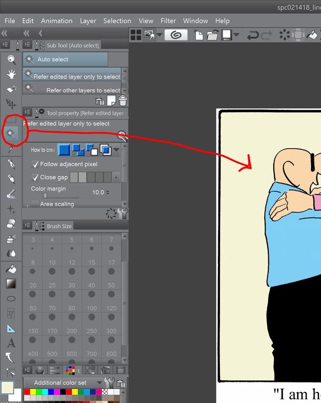
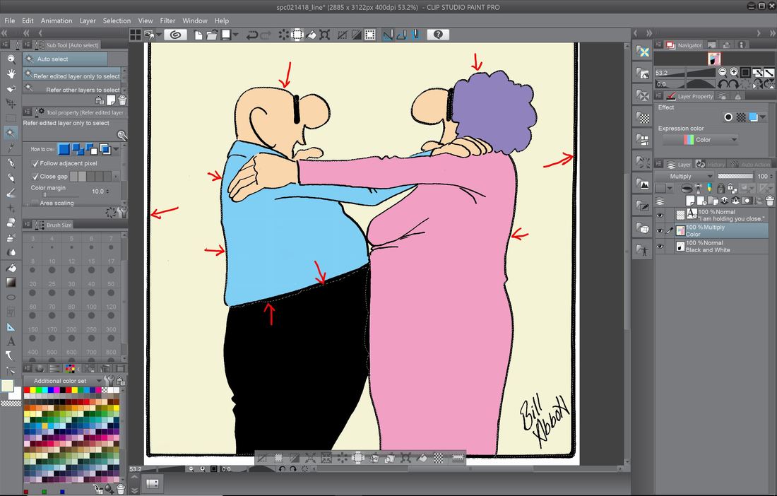
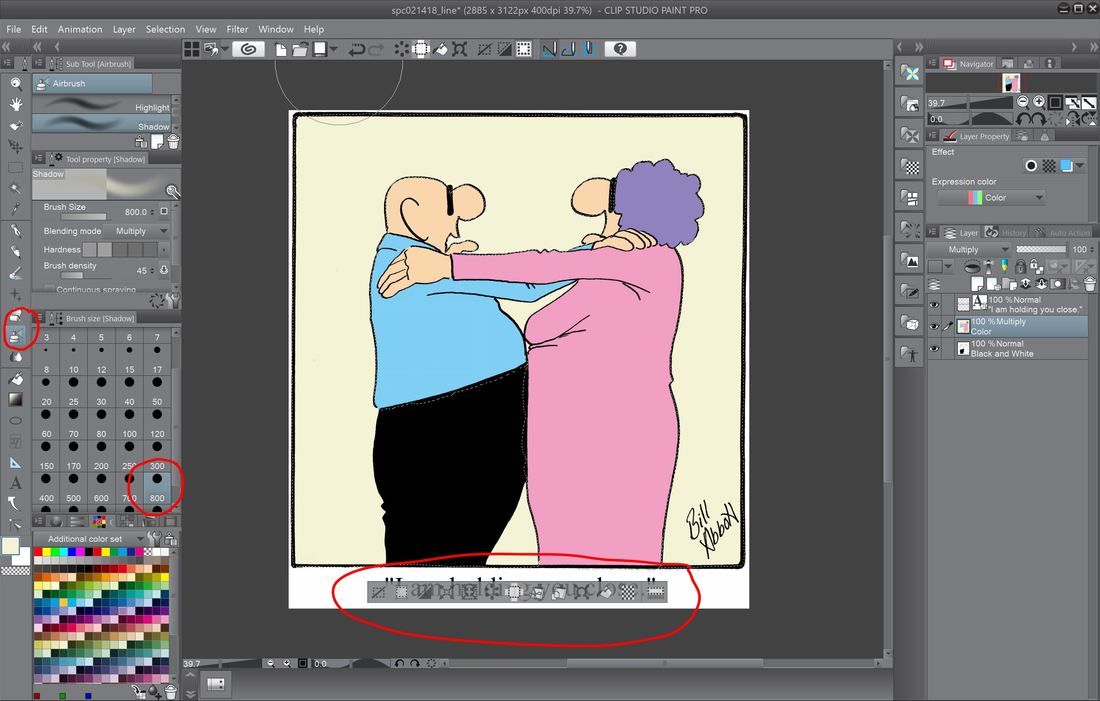
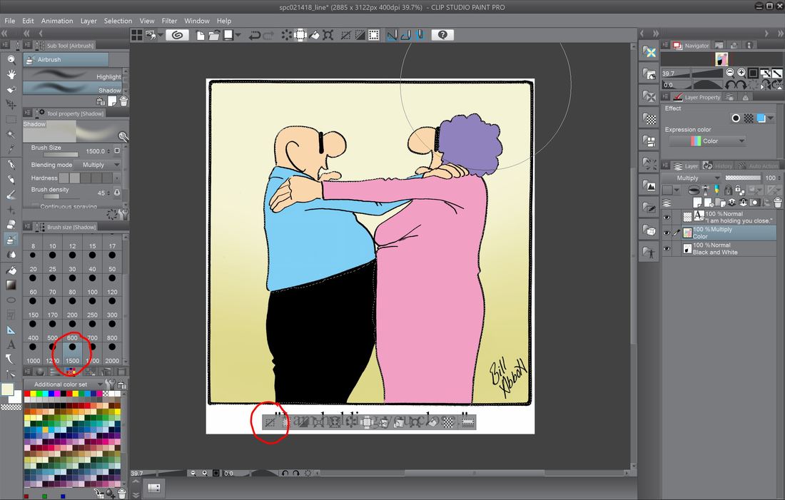
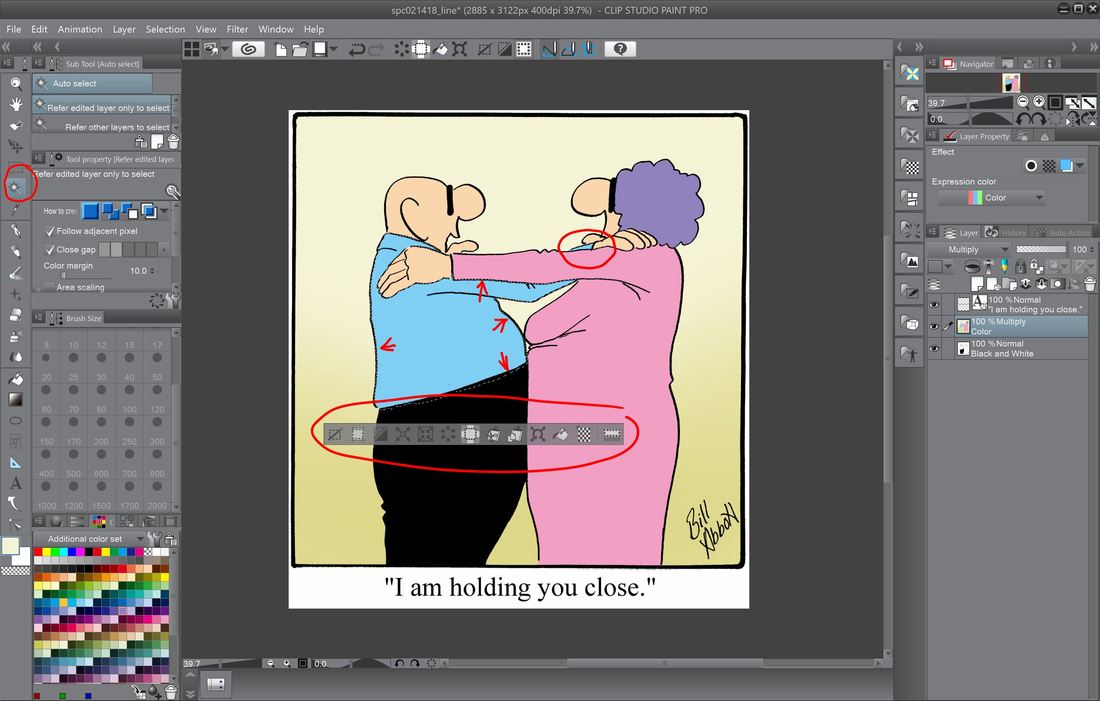
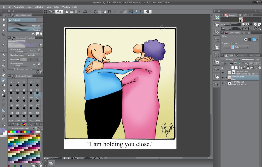
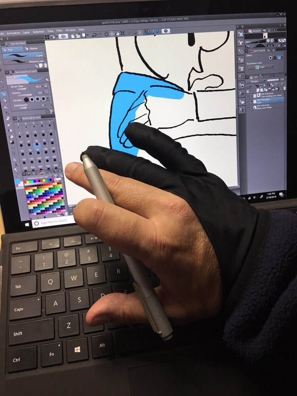
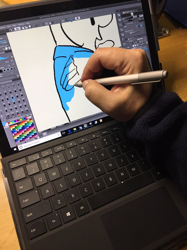
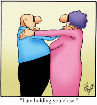
In Part 1 of our series on coloring Spectickles cartoons, we talked about the basic formatting and ended up with a completed black and white Spectickles cartoon. That's necessary before we move on to the next section - this section, where we discuss what layers are and how we use them in applying color to our cartoons. First, what is a layer? The way I think about them is they're like a clear piece of plastic that you're going to lay on top of our black and white cartoon. What we do on that clear piece of plastic won't effect the black and white cartoon beneath it, which is something, as you'll see, we'd prefer. And fortunately, with the Clip Studio Paint Pro program, as with most other drawing programs, we can turn the layer on and off for our purposes. So, rather than keep explaining in words only, let's take a look at our screen and talk a bit more about where to find layers and how to set them up. Here's where we left off in part one, with a completed, formatted black and white Spectickles cartoon. When it comes to our first steps in adding color to a Spectickles cartoons, we need to turn our attention about mid-way down on the right side of our Clip Studio Paint Pro screen, where we'll have a look at the 'layers' section. When we left off last time, we had 2 layers - our bottom layer which contains the black and white cartoon, and laid on top of that is our text layer. And remember too, whichever layer is highlighted in that blue/green color is the active layer, or the layer that'll be affected by anything you do in the image. In the area I've circled in red - that's where we click to add another layer, which we'll do now for our color. As you see highlighted, the active layer is the one we've just added, which is sandwiched between our black and white layer (which for whatever reason is just labeled as 'white' - we'll change that) and the text layer on top. As we work with our layers, we'll want to keep them straight - we want to know at a glance which one we're working on, so it's useful to label them accordingly. In order to change the name of the layer, just double-click over where you see 'Layer 1'. When you double click on the layer, the box will open and allow you to relabel. In this case, I've changed the color layer to, oddly enough, color, and the black and white layer to - you guessed it, black and white. Next, you'll notice just above where we relabeled our layer to 'color', it says 100% Normal - we'll need to change that to 'Multiply' so the layer interacts differently with the other layers - you'll see why in the next screen. In the screen above, you can see I've changed the layer to 'Multiply' from 'Normal'. Do you see where the little lighthouse-looking thingy is next to the blue and yellow pencil icon? Just above that is a dropdown box which now says 'Multiply'. Prior to clicking on the dropdown and making the change it said, 'Normal'. So as I'm sure you've guessed already, click on that box and make the change. The reason we want the layer to 'Multiply' is that when we color, if it's on the 'Normal' setting, it'll color over the layer beneath it, so it looks like your obliterating the underlying black and white. By making the layer, 'Multiply', it'll interact with the layer beneath, so you'll still see your line work as you color. Now that our layers are all set up, we're ready to have a look again at the left side of the Clip Studio Paint Pro work surface and tools. The first bit of coloring I do is laying down all the flat colors - the shading comes later. On the left of the screen, I select the pen tool, which is circled in red and labeled 2. Once that's selected, above that labeled 1. is the type of pen, and in this case, my preference in the gel pen - I just like the type of line it produces - pretty much as simple as that. 3. is the width of the pen tip in pixels. If I were drawing lines, I typically use 17, where it's set now. But to begin coloring, I start with the background and make the pen tip really wide - usually over 800 pixels since at this stage, precision isn't required. And of course, below that is our color pallet to choose from. Because I want your eye to be drawn to the characters, the background color is usually pretty muted. As you can see where I circled on the left, I'm adding the color with the pen tip cranked up to 800 pixels and the color I chose is pretty bland. When I color the background, I'm not at all concerned with neatness - just get it done and I'll clean up all the white trim areas later. Next, I start adding color to the characters. Because this husband and wife team are the center of Spectickles, the colors I use, for the most part, should be the same to help make them instantly recognizable - the husband's shirt is always the same blue, and the wife's dress is always the same pink. When it comes to coloring the characters, I need to be precise in the areas that terminate at another color - coloring within the lines, except in places where it doesn't matter, as you see at the bottom of the cartoon. More color applied - in this case the wife's hair. See Ma - I'm staying within the lines! Now that all the flat colors are applied, it's time to clean up around the edges. You can see encircled in red is the eraser tool. That can also be enlarged as needed - you can see here it's currently at 120 pixels. Here the flat colors and cleanup are all done, and we're ready to start some shading. One of the really great tools available in Clip Studio Paint Pro, and other programs for that matter, is the 'Magic Wand' tool. When I'm going to apply shading, I'll click on the tool, which is circled in red above, then hover over the area I intend to color, then left click on it. When you do that, the Magic Wand will select that area of contiguous color - you'll see a pulsing dotted line around the area when it's selected, and whatever actions you take will only effect that area. So for shading, I make sure I've got the right color selected that I wish to use for shading, then move down to the next tool we'll talk about, the 'Airbrush' tool. Above you can (hopefully) the active dotted line that surrounds the area of contiguous color selected by the 'Magic Wand' tool. Also, when the are you've selected with the 'Magic Wand' is active, an elongated box with show up beneath the area you've selected with a group of additional tools for manipulating the image. But since they go beyond the scope of our current topic, we'll save those for another time. On the left of the screen you can see a tool that I've circled that looks like the top of a can of spray paint - that's the 'Airbrush' tool we'll use. Below that is the spray area - just like with the pen and eraser, measured in pixels. When you want to deselect the area used with the 'Magic Wand' tool just click on the left-most icon within the elongated box, circled above. When you use the 'Magic Wand' tool, it will only choose the section of color that is contiguous. If it is separated by another color, it will remain unselected, as circled above. The final results of using the combination of 'Magic Wand' tool and the 'Airbrush' tool to add a shading effect to the now complete cartoon. No, this isn't a poorly chosen fashion statement - it's a half-glove I use to prevent the palm of my drawing hand from interacting with the screen as I draw and color. The software is actually really good in preventing it from happening, but I don't have time to discover too late that it didn't work. Coloring on the Surface Pro 5. The completed cartoon. Thank you again for spending time here. Up next, the step-by-step process I use in creating the now all digital Percenters cartoons.
8 Comments
2/20/2018 10:14:31 am
We use different tablets and software, but the techniques (and gloves) are very similar. The biggest difference is, because I draw my line art electronically, I created a template with pre-named layers, custom brushes and color palette. What a difference from my previous life drawing with brush and ink.
Reply
2/24/2018 07:35:45 am
Thanks for sharing your colouring technique Bill, I found it very interesting. I use Photoshop and employ the same process with 'multiply' layers as well for colouring.
Reply
8/26/2021 01:07:35 pm
Fashion in the 60's The 60's were a time of change and challenge. They brought hippies, space age, folk music, and the Beatles. Women's skirts got shorter, men's hair got longer, and everyone talked about love. The 60's was characterized by the feeling that a break with the past had been achieved. Clothes, furniture, and products all looked newer, brighter, and more fun. The swinging 60's were at their height. Women's hemlines were very short. Fashion in the 60's tended to encourage exhibitionism.
Reply
9/5/2022 09:38:46 am
Really informative article, I had the opportunity to learn a lot, thank you. https://freecodezilla.net/nulled-v-1-1-9-envato-elements-photos-elementor-templates-free-download/
Reply
Leave a Reply. |

 RSS Feed